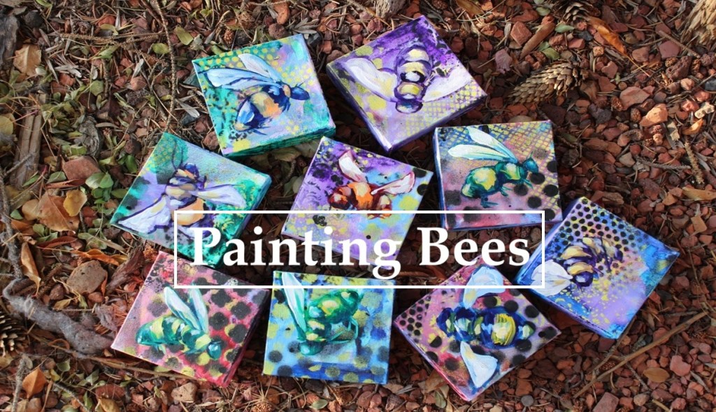
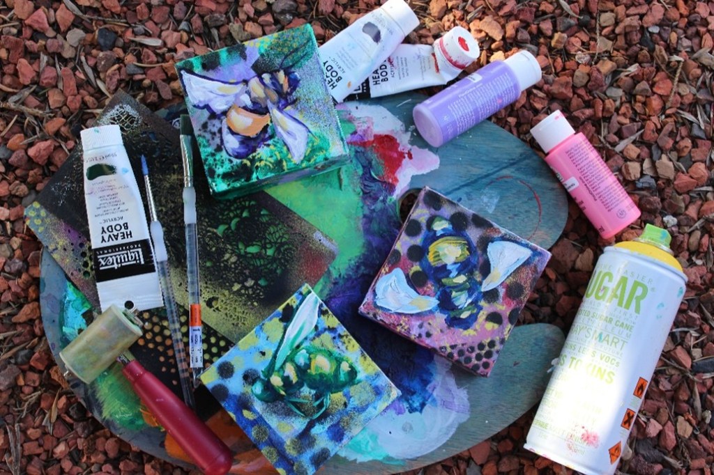
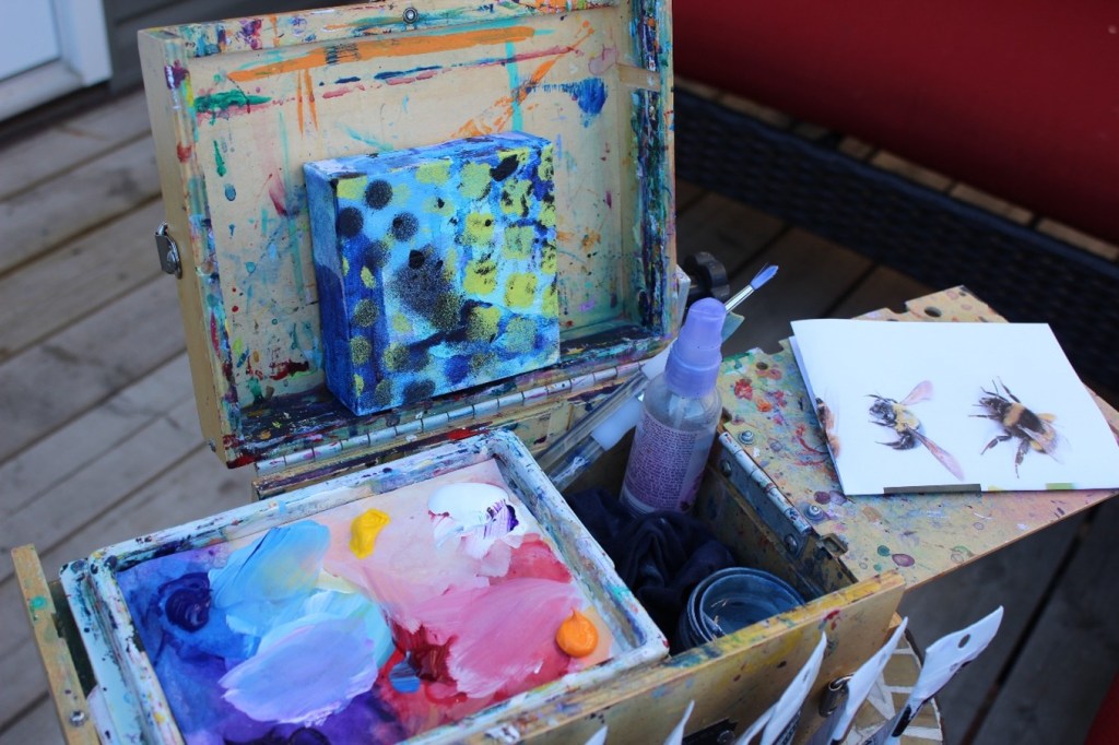
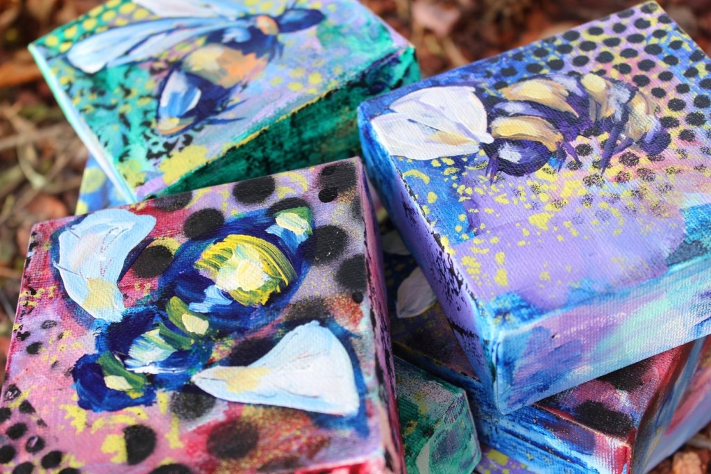
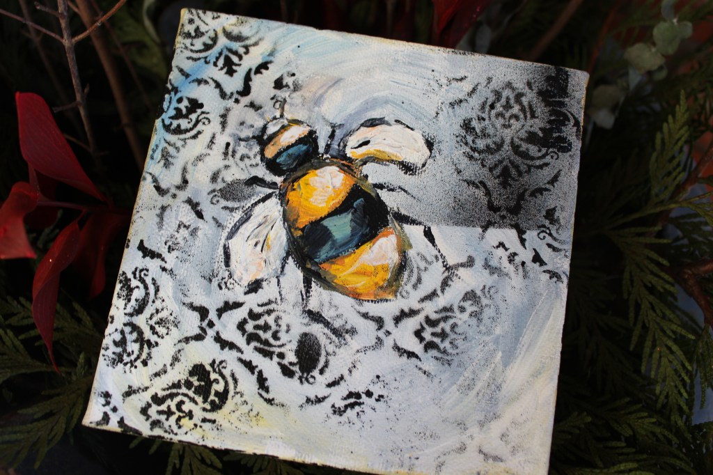
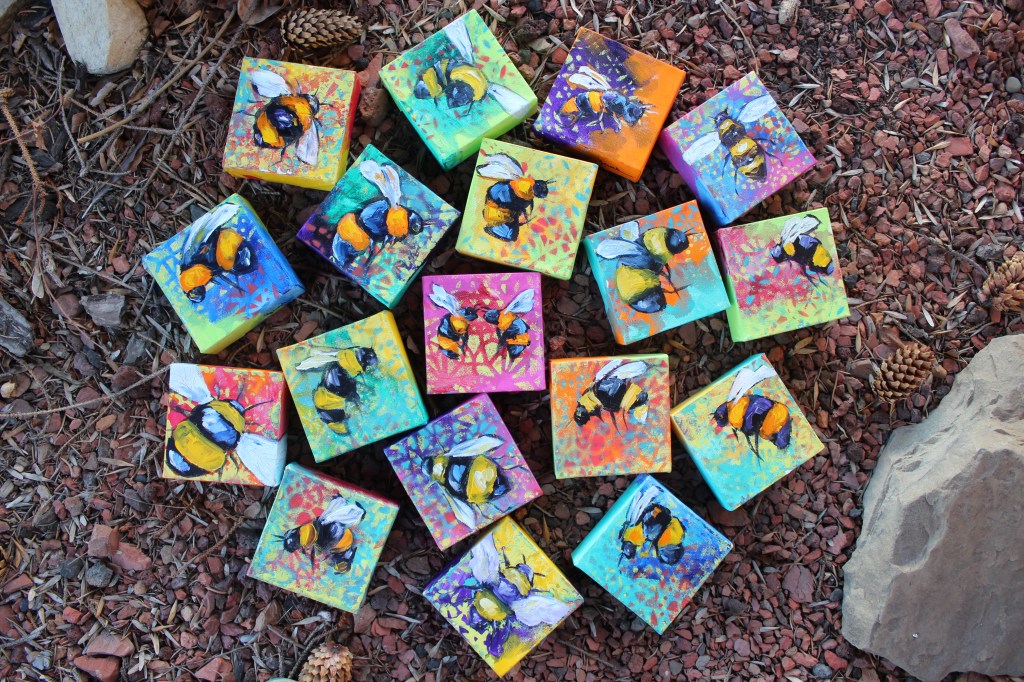
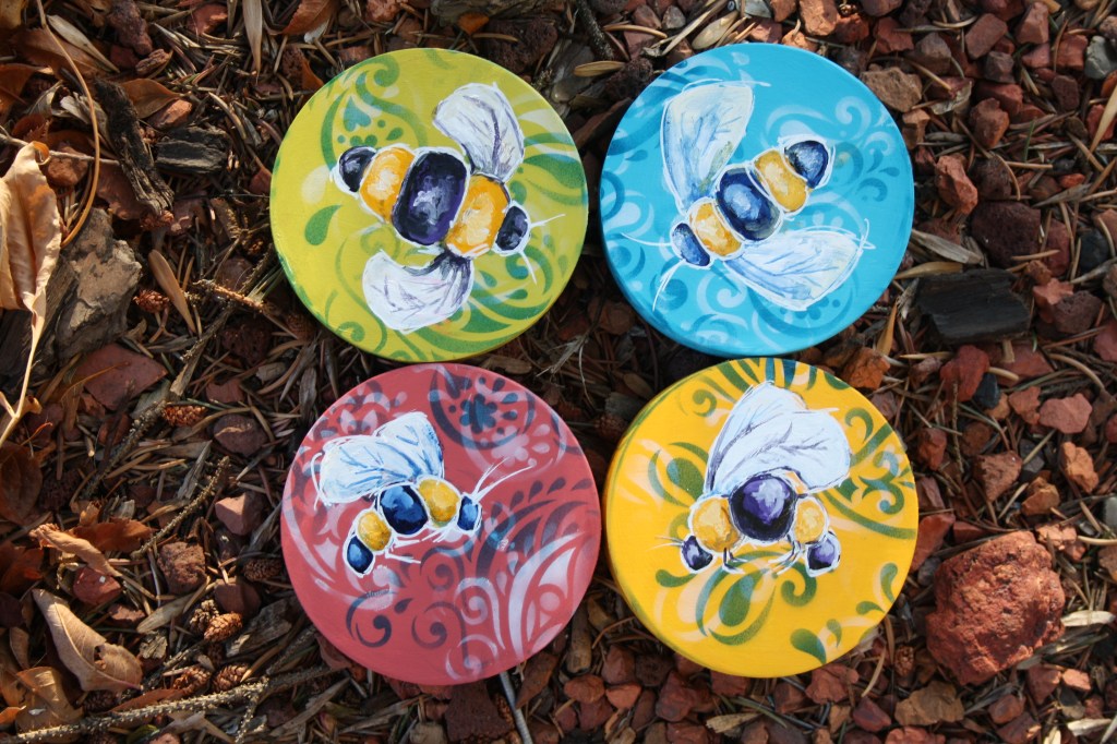
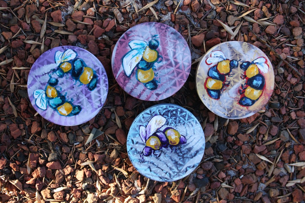
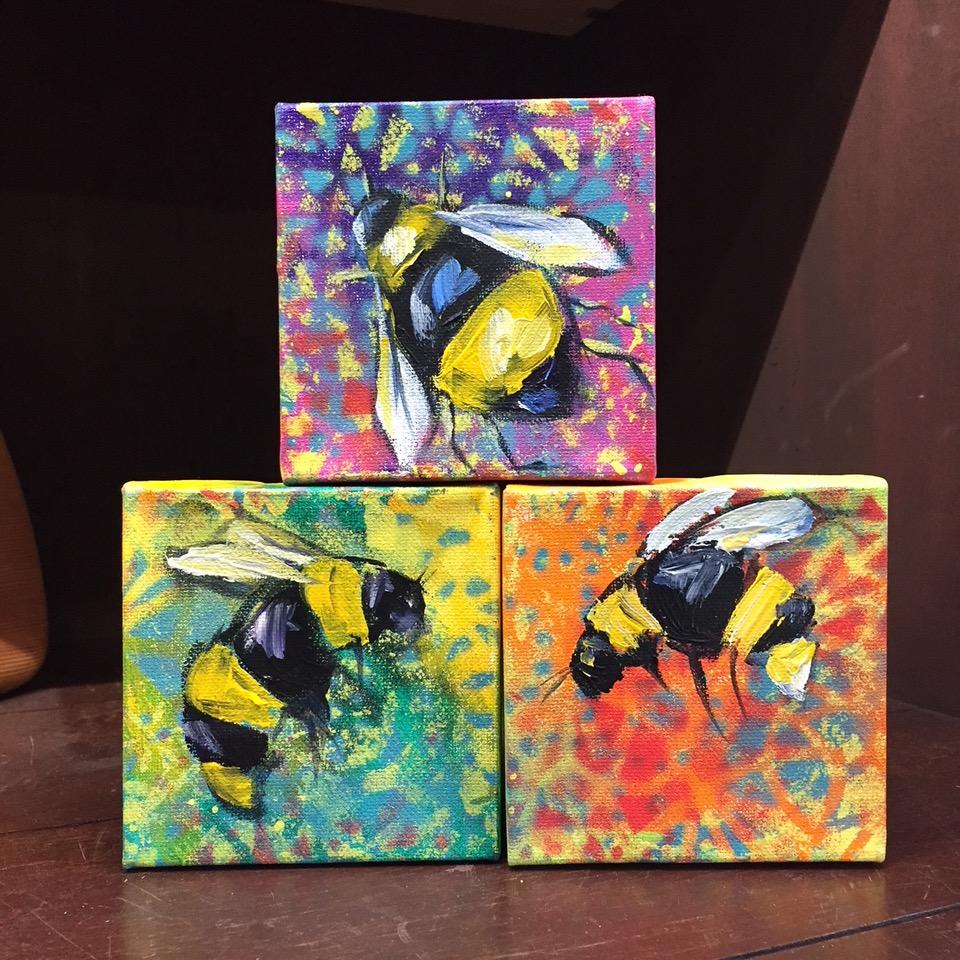
With so much attention on the plight of bees in our world, and spending hours watching them in the garden, I knew that it was important to capture them. The colourful flower beds inspired the backgrounds which are always fun to create. These bees are more cartoon-like with the use of reference photos as a guide. A fun way to spend an afternoon painting whimsical bees.
Tools & Materials:
- Stretched 4×4 canvas (options: paint panels or paper)
- Acrylic paints
- Flat and round paint brushes
- Water dish, rag & water spray bottle
- Reference photos of bees (libraries are great resources)
- Stencils (optional)
- Acrylic spray paint (optional)
- Brayer or small paint roller (optional)
Tips:
- I use several different sizes of paint brushes for added interest.
- A stencil brush and acrylic paint or simply adding patterns with paint brushes can be used instead of spray paint.
- If using paper, coat with a layer of white gesso to add texture and substance to the surface.
- Clean water dish regularly to keep paint colours vibrant.
Directions:
- Using acrylic paint and brushes and brayers/rollers and plenty of water (a spray water bottle also works well), apply colour liberally on the canvas.
- Allow to dry well in between layers in order to keep colours vibrant.
- Using a translucent paint (or acrylic ink) and flat brush, add a transparent layer of colour in spots around the canvas (don’t cover all of the initial layer). Wet with plenty of water and allow the colour to spread and drip.
- Once that layer has dried, take your stencils and spray paint to a well-ventilated area and begin adding patterns. Pay attention to repeating pattern and colour around the canvas in order to keep the image interesting and the viewer’s eye moving around the surface. An option is to use the stencils with a paintbrush or sponge or to use items around the house such as jug lids, spatulas and brushes to add patterns of lines and circles. Finger tips create great dots.
- Using the reference photos and a small round or flat brush along with a deep colour such as dioxazine purple, pthalo green, pthalo or Prussian blue or alizarin crimson to draw a bee directly onto the canvas. If you are unhappy with a line, just wet and wipe away with a rag. Using the deep colour, fill in the dark areas of your bee and then use orange or yellow mixed with white to add lines. White is also used for the wings but since the previous paint is still wet the colour will draw into the wings which adds to shadow effects.
- Finally, allow to dry and then add final highlights on the bee’s back and face and with thinned deep colour add shadows around the edges.
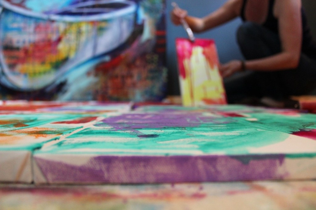
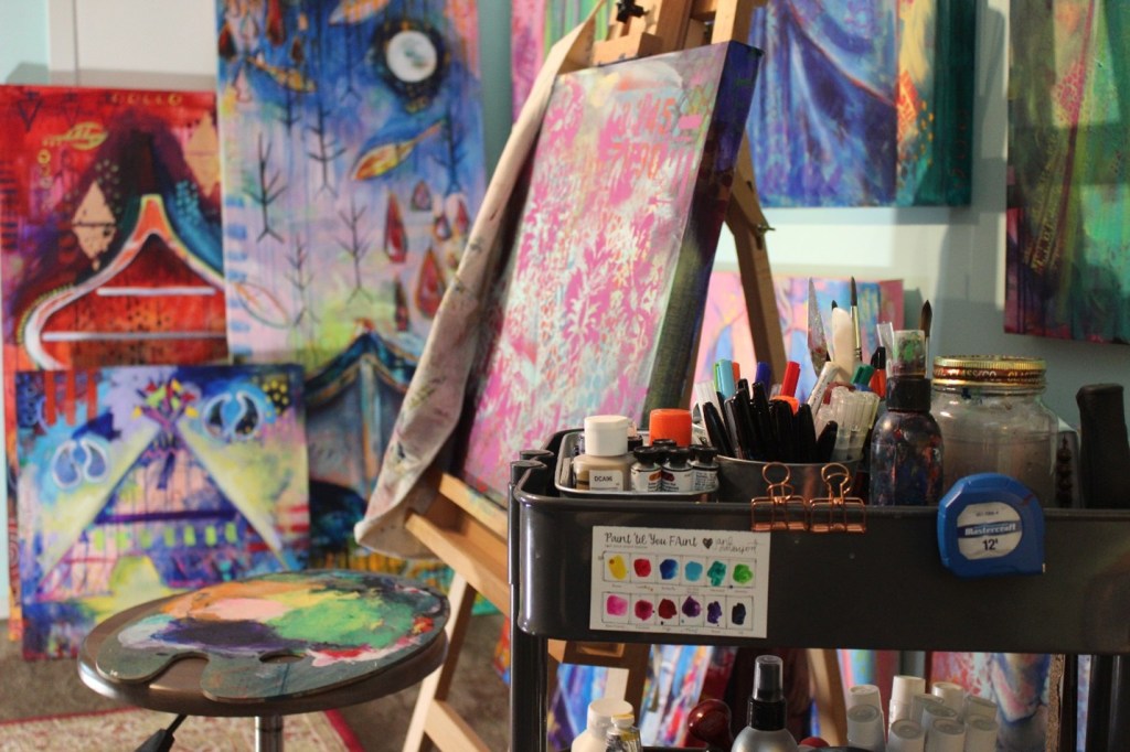
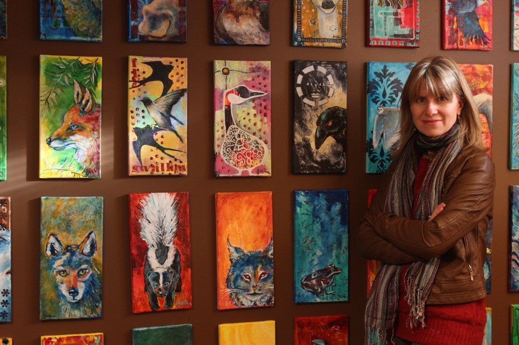
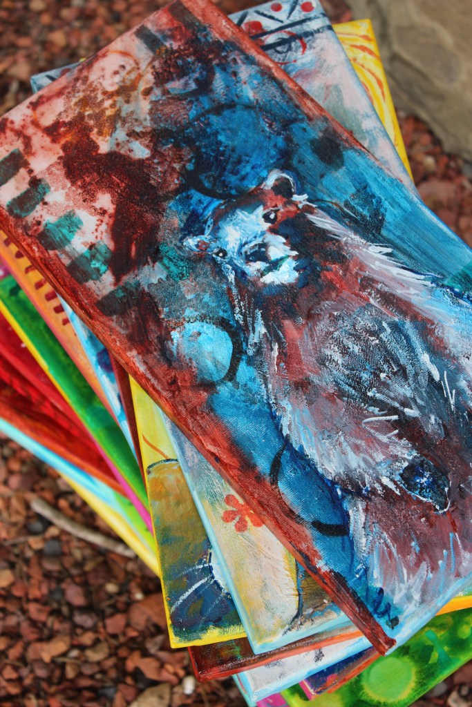
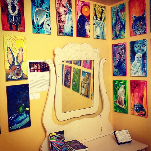
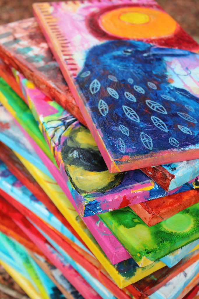
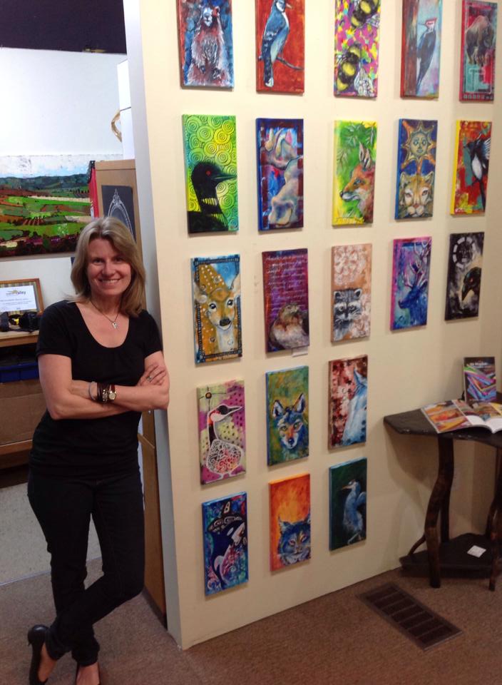
I grew up in an Indigenous region in northern Canada where I was taught by local grandmothers to bead and weave and to pay attention to the plants and animals of my surroundings. Occasionally a bear or wolf or wolverine, among other animals, would wander through town, something that still happens in my community.
As a young girl I was inspired by ravens. Each morning I saw one in front of my house and he would walk nearby, being as curious about me as I was about him. And he would chatter as I walked through the forest. When I grew up I often dreamed that a raven landed on a snow covered branch over my head. Finding your métier or heart map is important as an artist. That thing inside of you that knows exactly where and what you should do at all times. This is the same thing you do regardless of time, energy, space. There is no need for excuses as this work is necessary, not only for you but a gift to everyone around you.
SUPPLIES:
| Gesso DAP Spackling Gel medium Palette knife (mixing tool) Stencils (optional) Sanding block Rubbing alcohol + dropper | Acrylic paint Paintbrushes (1/4” + 1” flat + liner) Heat gun or blow dryer Water dish Spray bottle Rag Paint pens or Sharpees |
PREPARATION
Before I begin work in my studio each morning, I follow a few rituals which I created for myself…to make myself a cup of green tea, to light a beeswax candle, and to refresh my space with sweet grass spray. Growing up in the north, for any special occasion an elder or grandmother would bless the occasion with a smudging ceremony by lighting cedar and blessing us with the words:
“When the smoke clears I will only speak the beauty of you…
When the smoke clears I will only see the beauty of you…
When the smoke clears I will only hear the beauty of you.”
~ Cree Smudging Ceremony
Because my husband is severely allergic to smoke, I prefer to use a sweet grass spray which was created by a Cree herbalist…it smells heavenly and because the sense of smell is strongly connected to memory, I find that following these small rituals connects me to my creative mind quickly and brings a sense of calm and peace to my space. Also, I tend to clean my studio at the end of my working session so that I am prepared to walk in and immediately focus on creative work in the morning without the need to tidy first which serves three purposes…one is so that the space feels peaceful instead of cluttered and just another job on my list of to-do items, two is so that I can begin creating immediately without having a chore to complete first, and three is so that my tools like brushes and paint are well taken care of so that they last longer and work better.
STEP 1
I like to begin working in my journal by adding some texture to the pages. Because gel media can be very ‘sticky’ even once it’s dry (pages can stick together) I like to add another medium to it, sometimes modeling paste and other times spackling (which is much less expensive). Both those media will crack on a flexible substrate (like paper and fabric) but I find that when I add gel media to them, they become more flexible.
I like using a coarse bristle brush to create lovely brush marks, but also to use stencils along with a palette knife using a thin coat of the mixture to leave raised patterns. This has to dry for at least an hour. Once dry, I coat the entire page with gesso.
STEP 2
While my pages are drying, I begin researching my animal. First I like to quiet and center myself to pay attention to the animals that have shown up in my life over the past few days. I like to use a form of journaling known as free writing, just writing as thoughts come to me while I consider whether an animal has crossed my path recently or that I connect or identify with? What is it about that specific animal that I connect with…colour, pattern or form? If colour, what does that colour symbolize? If pattern, does it remind me of something else? If form, does its form replicate a form that I am surrounded by? Does it bring up memories of my youth?
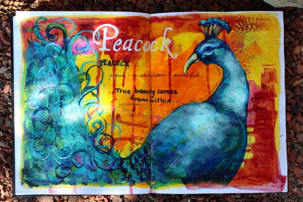
Recently we visited the zoo where the peacocks were in abundance, preening in all their glory. The light reflected off their radiant tails and I was struck by their beauty. After that visit, images of peacocks kept showing up for me in china patterns, fabric, and books and the word peacock kept showing up in stories and on television and in movies. I realized I needed to pay attention so I began to research the meaning.
STEP 3
Though I do enjoy preparing my surface, I really have fun once I start adding colour. Some of my favorite colours for beginning artwork are the heavy staining ones such as alizarin crimson, pthalo or Prussian blue, quinacridone magenta and dioxazine purple. I tend to prefer heavy body paints as they can be thinned with water or thinning mediums.
One of my favorite ways to fill a surface with colour is to thin paint with a little water and brush it onto the surface, spray it with water and then allow to sit for a moment. Then, I tilt the surface to allow the paint to run down. I still manipulate the paint with my brush but it’s the drips that interest me. Add a few colours and allow to dry. NOTE: If you don’t want muddy colours like greys or browns, use a layer of warm (orange, yellow, red) allow to dry (or dry with heat gun or hair dryer) and followed by a layer of cool (blue, green, purple), or vice versa. You can repeat these steps for several layers of colour and pattern.
STEP 4
Many years ago my mentor suggested I put away my drawing utensils and use my brush and paint to draw directly onto my painting surface in order to loosen up and to trust my creative brain. When I work on canvas I keep my spray bottle and a rag nearby in case I want to ‘erase’ what I’ve done, but painting over any errors works just as well and adds interest to the final piece.
STEP 5
This is an optional way to add pattern, but I like to prepare a small dish of rubbing alcohol and a dropper. After an initial layer of colour has dried on my surface, I prepare a second paint colour by thinning it to the consistency of cream. I paint a layer of this colour on my surface and immediately use the dropper to place drops of alcohol strategically on the paint and watch it separate into circles.
STEP 6
Once this layer of paint has dried, I begin adding shadows and highlights to give form to my shape paying attention to which direction the light would be coming from and placing all my highlights on that side with a minor reflected light on the opposite. I add final details and touches with a liner brush and/or paint pens, adding a highlight on the animal eye(s) last.
STEP 7
After the image has completely dried (I usually give it 24 hours), I will add some of the information I’ve gathered on the meaning of the animal in order to use this as a guide in my life. To add the title, I like to type the animal name into a MS Word document or online font generator until I find a font that I feel will complement my image. Peacock reminds us that true beauty comes from within and to shine boldly. Some of my favorite writing implements are paint pens, Sharpees and a calligraphy or fine liner paintbrush.
Ravens and crows have been part of my life for my entire childhood and I feel connected to them. Recently we had a porcupine living in our lilac bush for a week and I learned that they signify faith and trust and the need to let go of criticism. Every summer a rabbit lives in our garden, they represent creative energy, commitment and new beginnings. Both messages have come at times that I needed to hear them.
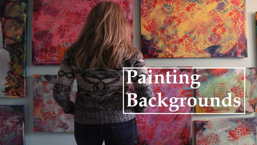
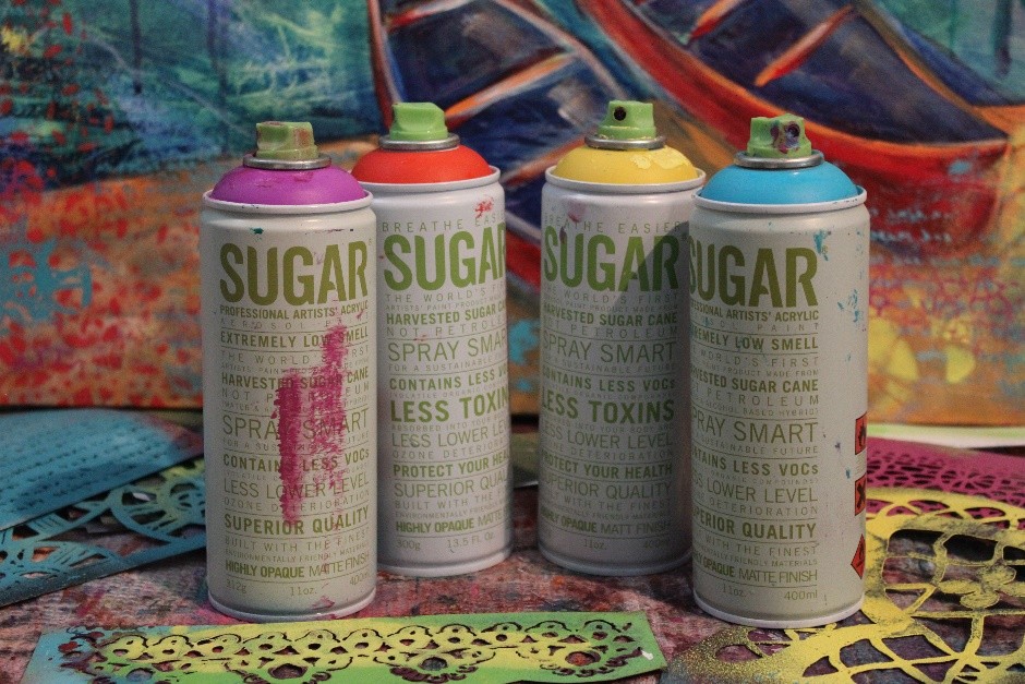
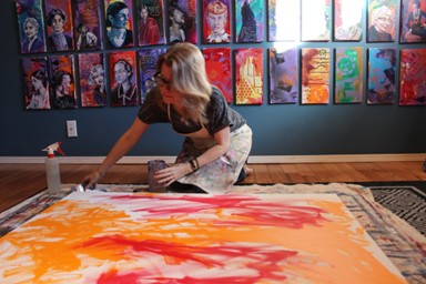
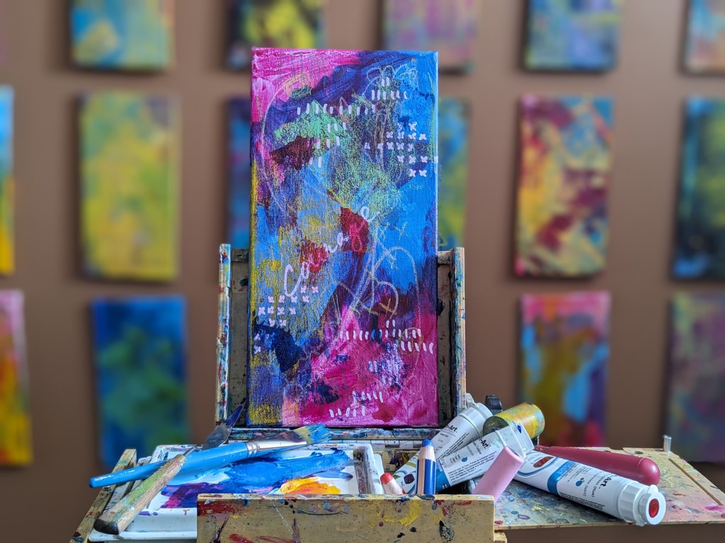
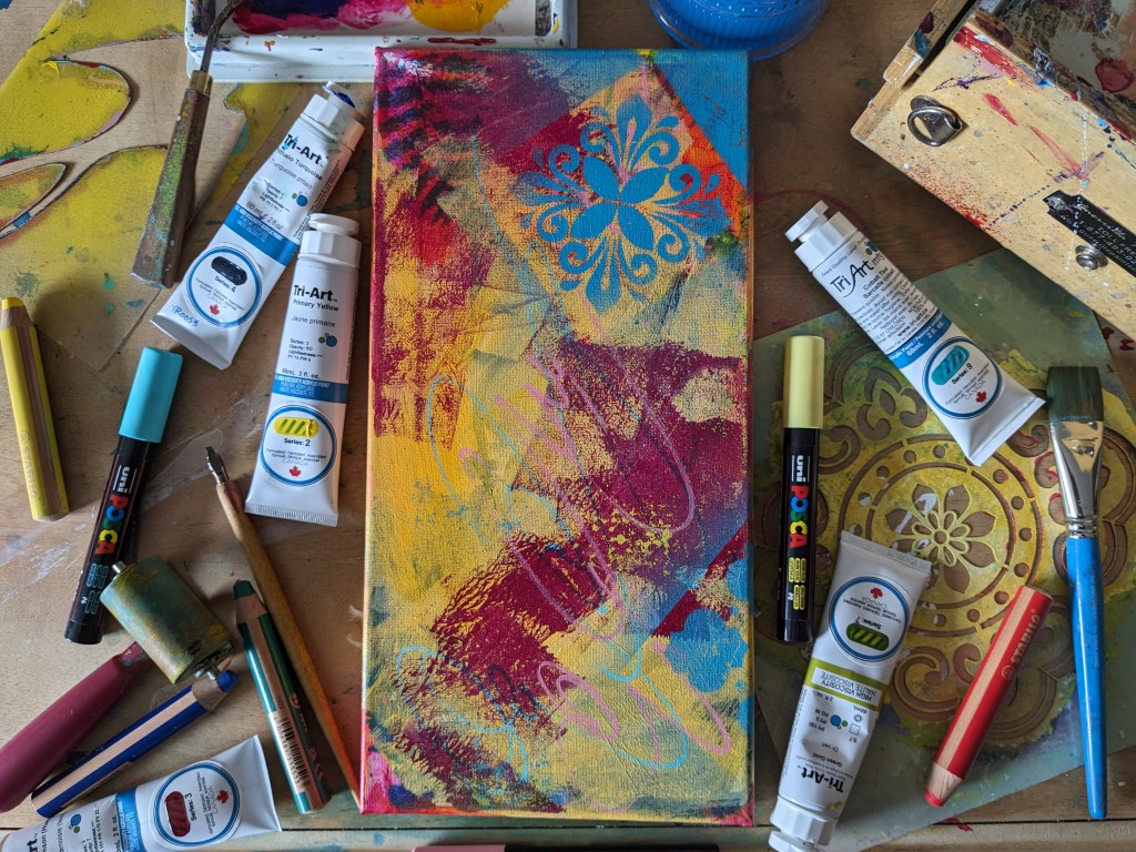
Facing a blank canvas can be intimidating. Using acrylic paints and stencils we will have fun creating an interesting surface that can be displayed as is or, as in other workshops, layered with imagery to create a finished painting.
Supplies & Materials:
- Stretched canvas, panel or paper
- Acrylic paints
- Acrylic ink (optional)
- Stencils
- Acrylic spray paint
- Variety of paint brushes
- Water dish
- Rag
Tips:
- I used several different sizes of paint brushes for added interest.
- A stencil brush and acrylic paint can be used instead of spray paint.
- If using paper, coat with a layer of white gesso to add texture and substance to the surface.
- Always use a mask in a well-ventilated space when using spray paint.
- Clean water dish regularly to keep paint colours vibrant.
Directions:
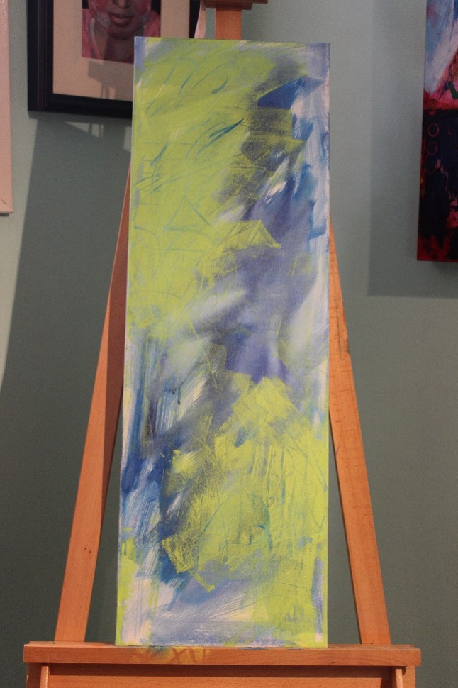
- Using acrylic ink and a paddle brush (or large house painting brush) and plenty of water (a spray water bottle also works well), apply colour liberally on the canvas.
- Allow to dry well in between layers in order to keep colours vibrant.
- Using another colour of paint and the 1 inch brush, add a transparent colour in spots around the canvas (don’t cover all of the initial layer). Wet with plenty of water and allow the colour to spread and drip.
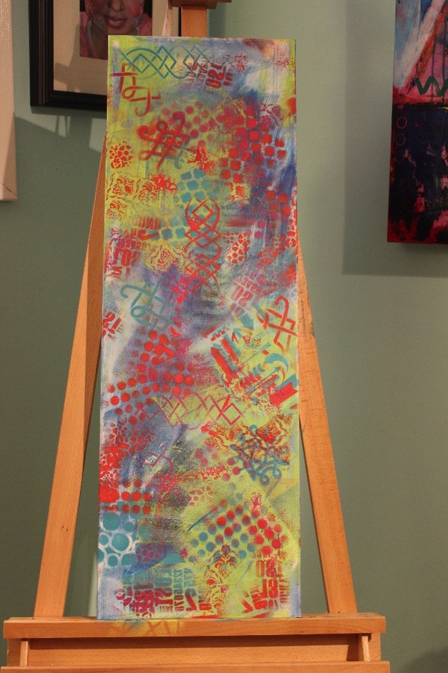
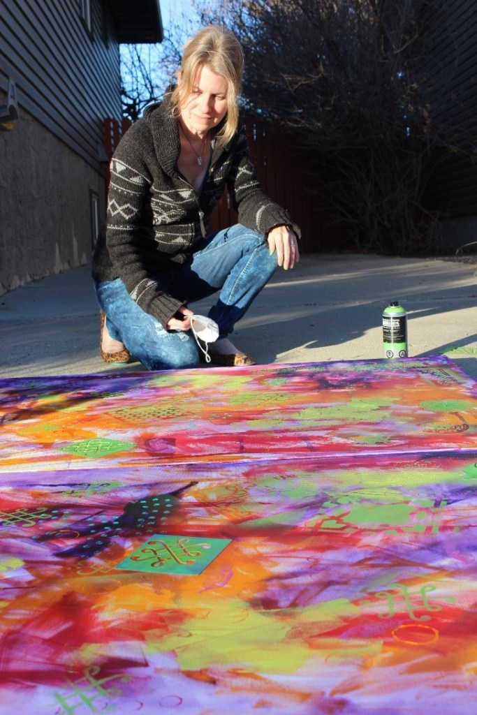
- Once that layer has dried, take your stencils and spray paint to a well-ventilated area and begin adding patterns. Pay attention to repeating pattern and colour around the canvas in order to keep the image interesting and the viewer’s eye moving around the surface.
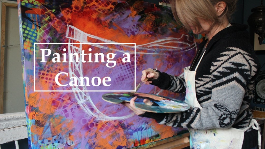
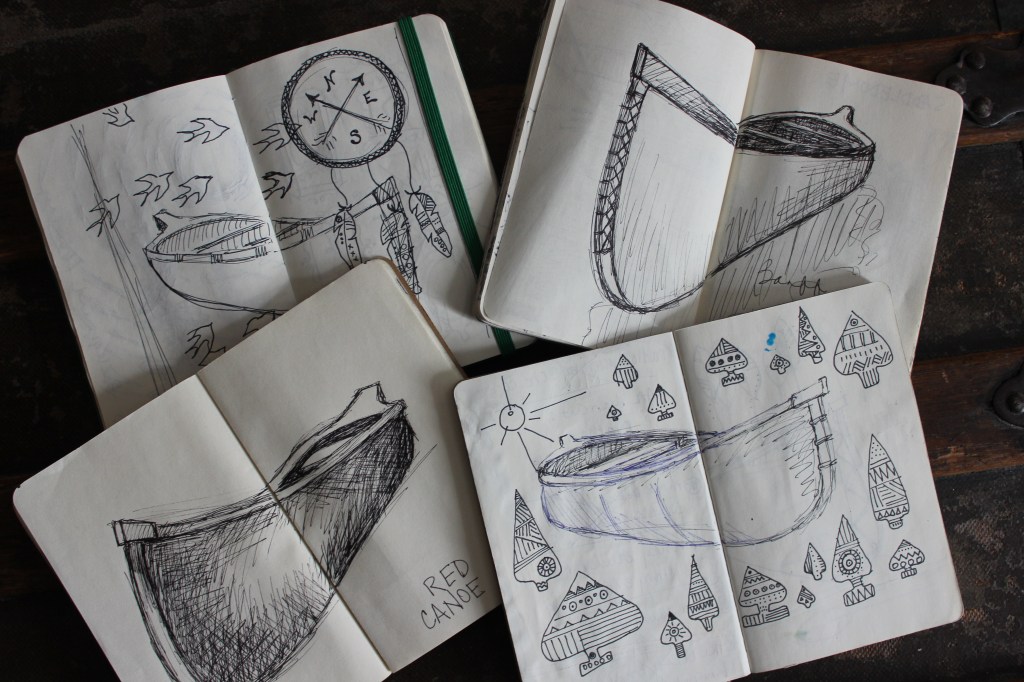
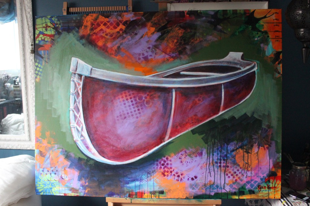
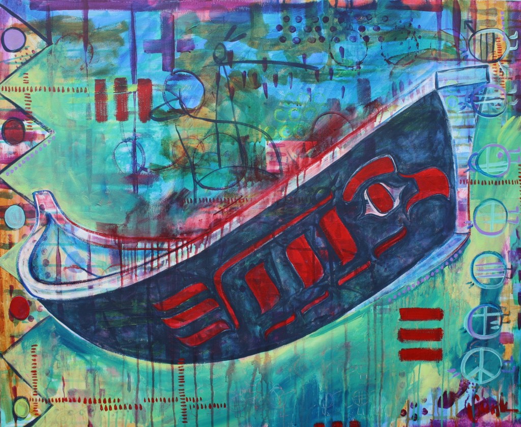
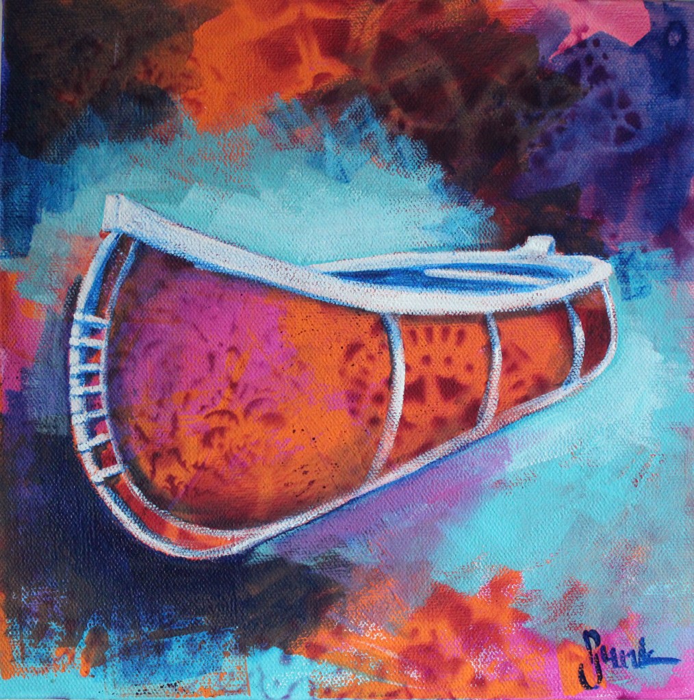
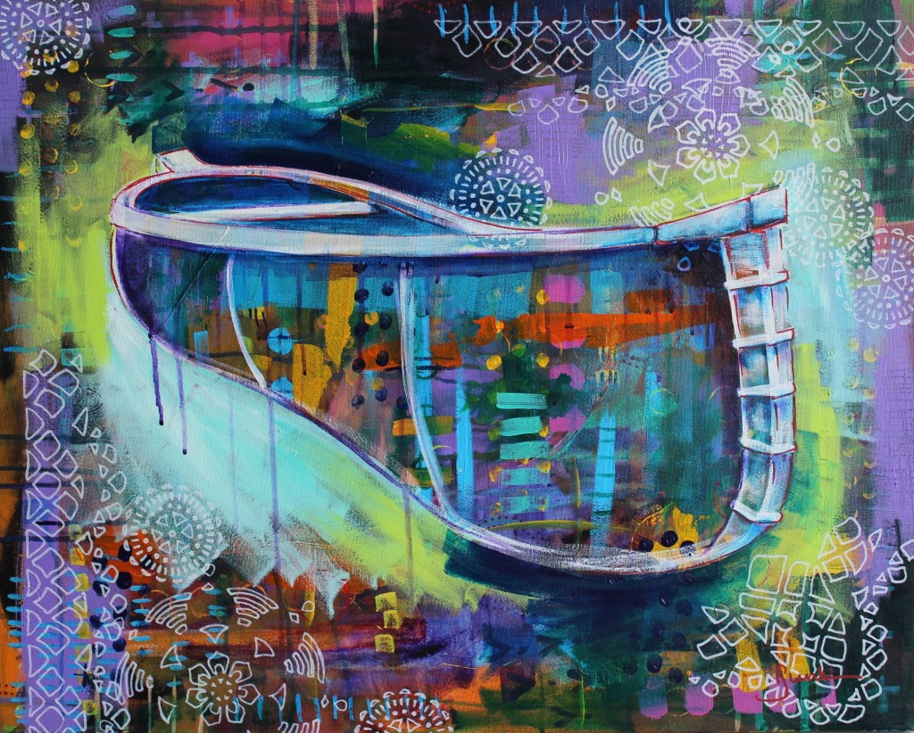
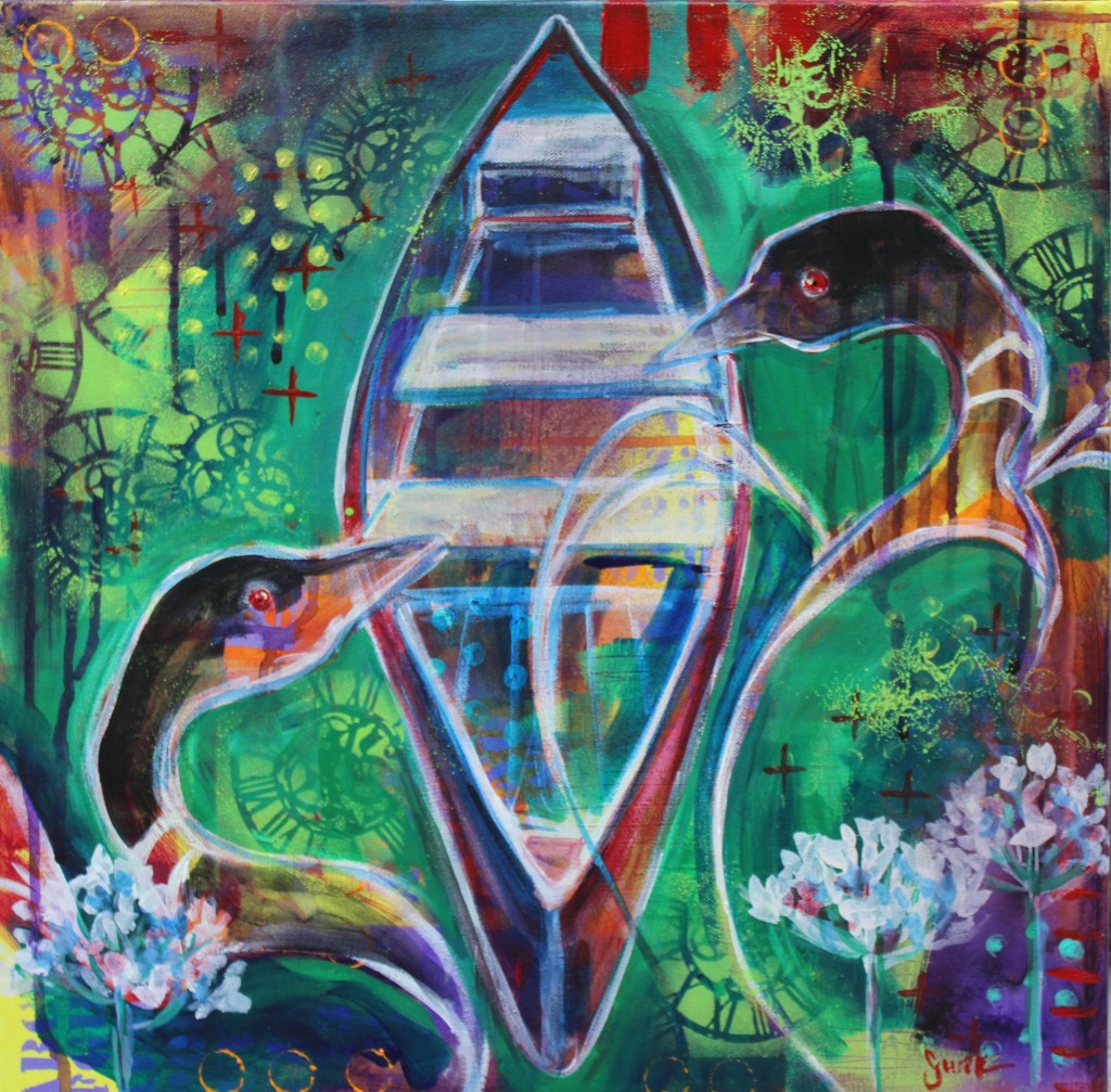
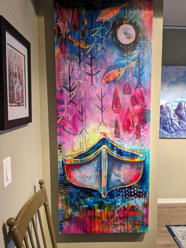
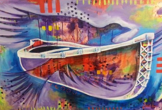
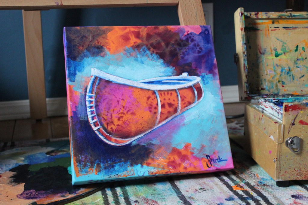
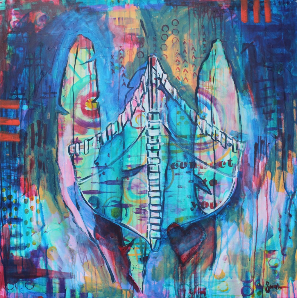
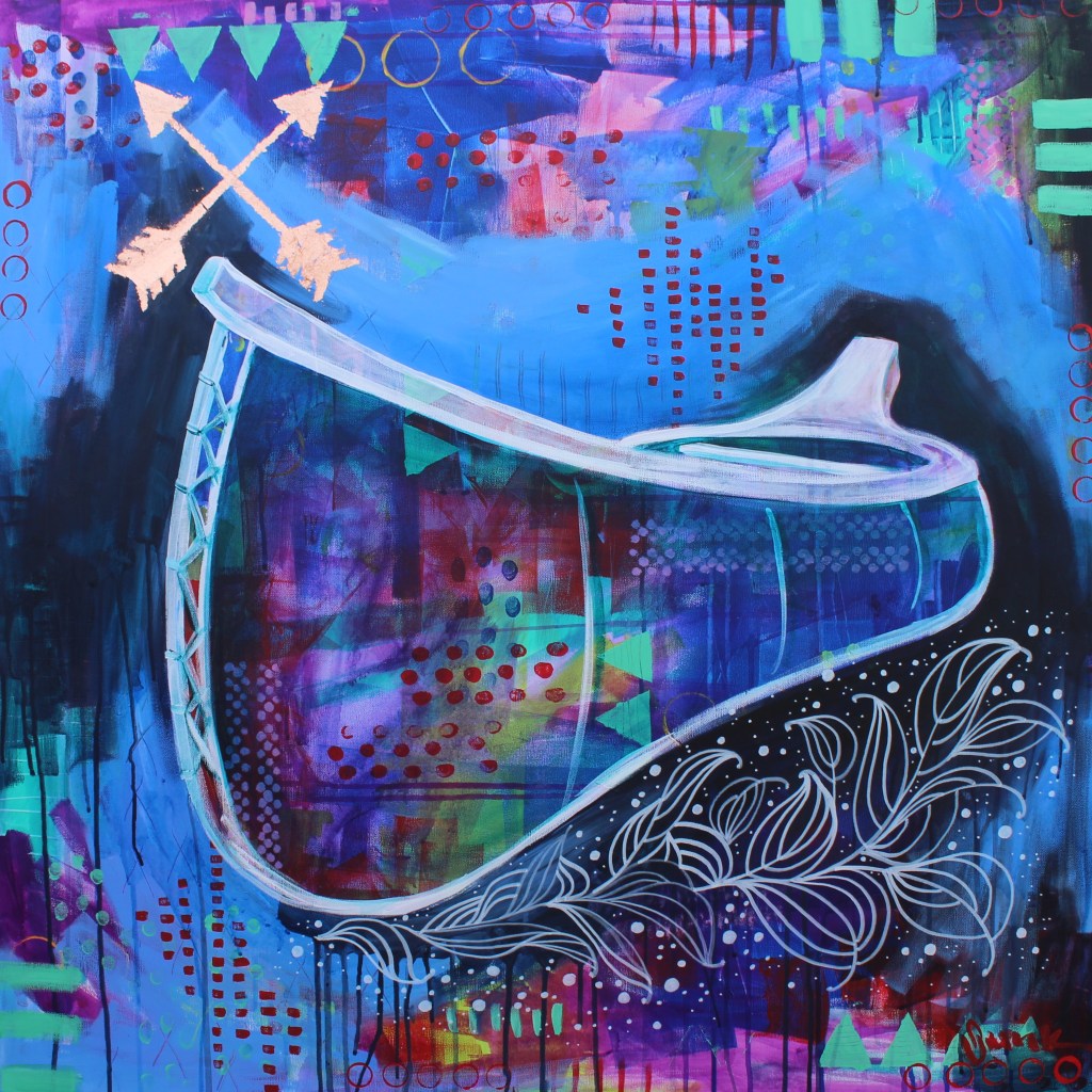
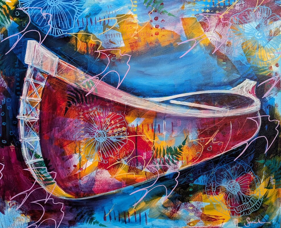
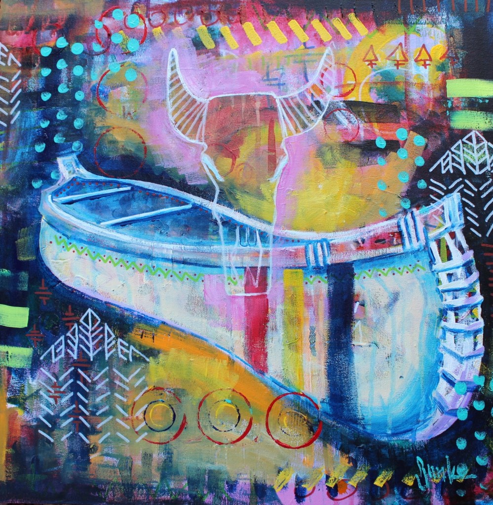
My family and I spend a lot of time in the Rocky Mountains where I’m always inspired by the canoes in the lakes and rivers. I always carry a small sketchbook and a pen wherever I go and try to sketch some of this inspiration as I prefer to work from sketches rather than photographs…it seems to allow me to work a little more loosely and to alter shapes as I go.
I also grew up near the Churchill River in the boreal forest in northern Manitoba where we often found canoes resting along the river and were taught the skills of wilderness survival. Canoeing became a large part of my youth, from the enjoyment of time spent in the forest to fishing and travel. I saw a canoe being built and the beauty of that process never left me. Though I never learned that process myself, I feel as though I have been given the gift of capturing the beauty and mystery of this sacred vessel in my paintings.
Drawing:
One of the most important things that I do as an artist is to draw every day. It never needs to be anything that could be considered ‘finished’ but keeping a small sketchbook on me at all times does give me a place to jot down ideas and keep inspiration for future projects. Drawing daily also helps to improve my skills. I begin to pay attention to distances between things (ie. Eyes are about halfway down a person’s skulls, the base of a nose between the eyes and chin, and lips between the nose and chin). Paying attention to details such as angles and distances, not literal but visual, helps to get the appearance of a 3-dimensional image in a 2-dimensional plane. I notice that whenever I don’t draw, my hand-eye coordination seems to struggle a bit. Occasionally I will also bring a small watercolour palette to play with to capture colours and shadows as well.
Drawing daily helps my eyes to really look and see what is in front of me…something that we often forget when we our eyes are bombarded with shapes and colours all day every day. My preference is a small 3×5 moleskine (which is available in most art supply and bookstores) and a pen or fine marker as I find that if I can’t erase lines, I don’t keep erasing until I get something ‘perfect’ (not possible for me) and the layers of lines add interest and contrast to my final sketch. These are just for me, in any case, to improve my drawing skills as well as to give me a starting point for new ideas. There are many wonderful drawing lessons available both online and in person, but I have found that constantly drawing is the best way to learn.
Supplies & Materials:
- Stretched canvas, panel or paper
- Acrylic paints
- Acrylic ink (optional)
- Acrylic spray paint & mask (optional)
- Stencils
- Variety of paint brushes
- Water dish & spray bottle
- Rag
Tips:
- I used several different sizes of paint brushes for added interest.
- A stencil brush and acrylic paint can be used instead of spray paint.
- If using paper, coat with a layer of white gesso to add texture and substance to the surface.
- Clean water dish regularly to keep paint colours vibrant.
Directions:
- Using acrylic ink, a large paintbrush and plenty of water (a spray water bottle also works well), apply colour liberally on the canvas.
- Allow to dry well in between layers in order to keep colours vibrant.
- Using another colour of paint and the 1 inch brush, add a transparent colour in spots around the canvas (don’t cover all of the initial layer). Wet with plenty of water and allow the colour to spread and drip.
- Once that layer has dried, take your stencils and spray paint to a well-ventilated area and begin adding patterns. Pay attention to repeating pattern and colour around the canvas in order to keep the image interesting and the viewer’s eye moving around the surface. Allow the paint to dry at least 24 hours.
Adding a Canoe:
- Using a round paintbrush and liquid titanium white acrylic paint (if using a heavy body paint, you can thin with water and/or thinning mediums – craft paint can also work well), I loosely sketch the shape of a canoe that appeals to me. I will alter the shape to suit the shape of the canvas as I like to fill a large part of the surface with that image. I pay attention to the angles, trying to assure that the front and back of the canoe are even, along with any bars or seats inside the canoe. Keeping them at the same or similar angle ensures that the canoe is visually interesting. Drawing them often helps to keep my eyes and my hands working together well.
- At this stage, I keep a rag and a spray bottle of water nearby so that I can ‘erase’ any lines I might be unhappy with…it helps to move away from the canvas throughout the drawing process in order to take a critical look at the shape. I also turn the canvas upside down or look at its reversed image in a mirror to see if I like the shape.
- Once the white paint has dried, select a colour (or two) to paint around the canoe in order to make the image pop forward from the background. In order to keep the colours vibrant, I try to allow plenty of drying time between colours, or use complimentary colours (ie. Green & blue, orange & pink, etc.).
- To further enhance the canoe, I select a transparent colour and using plenty of water on my brush, apply it to the body of the canoe. In this instance I used alizarin crimson. For the inside of the canoe, I used a darker pthalo blue that was also thinned slightly. I used the blue to add shadows to the underside, along the twine at the front and along the top edge of the canoe. I pay attention to wherever the shadows would naturally fall along any edges.
- Finally, I added the pthalo blue underneath the canoe and allow the thinned paint to run down the canvas. I found that this grounded the canoe while separating it from the background even further. Stencilled patterns can also be added back in at this point if deemed necessary.
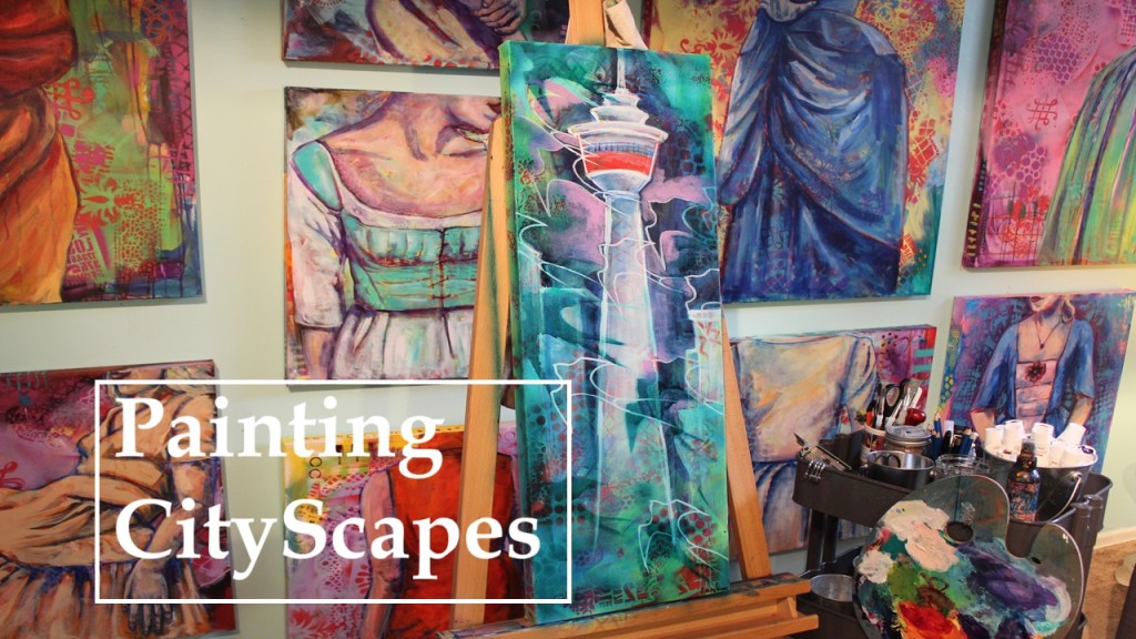
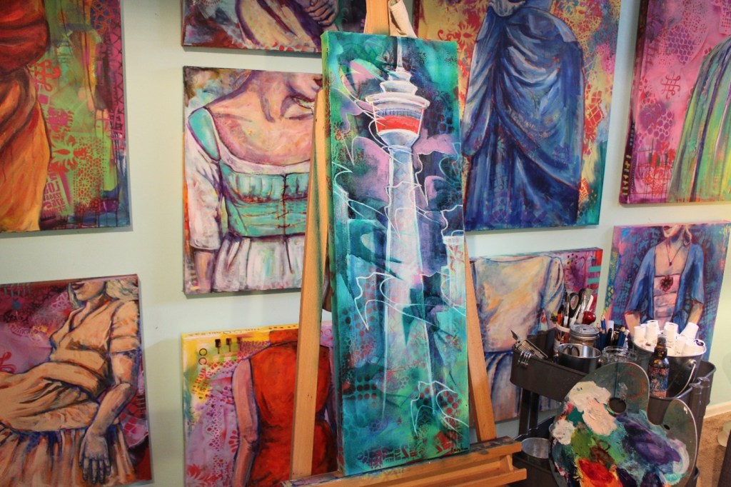
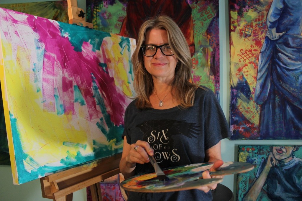
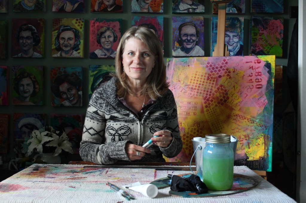
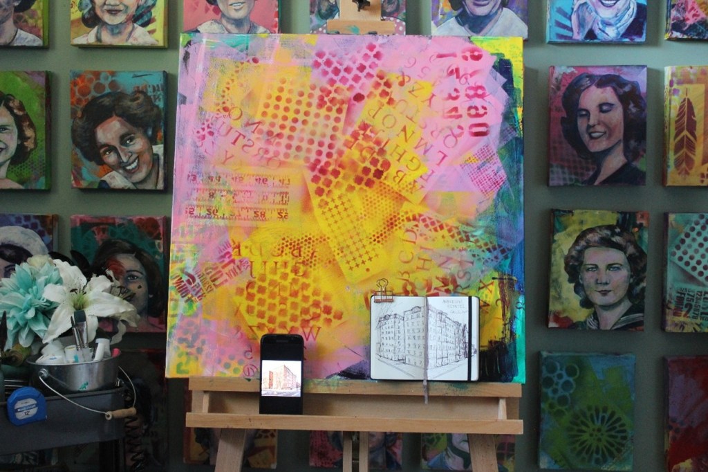
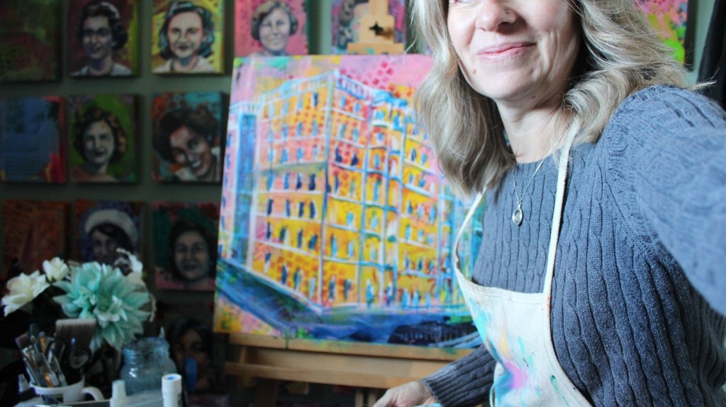
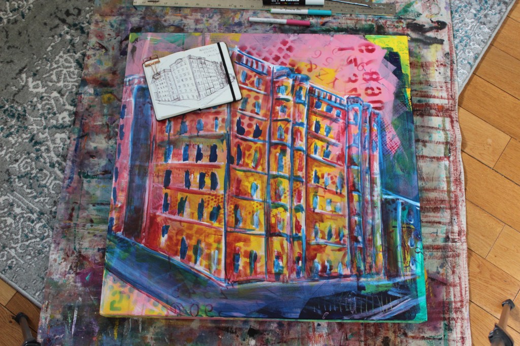
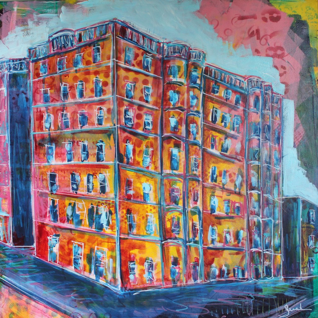
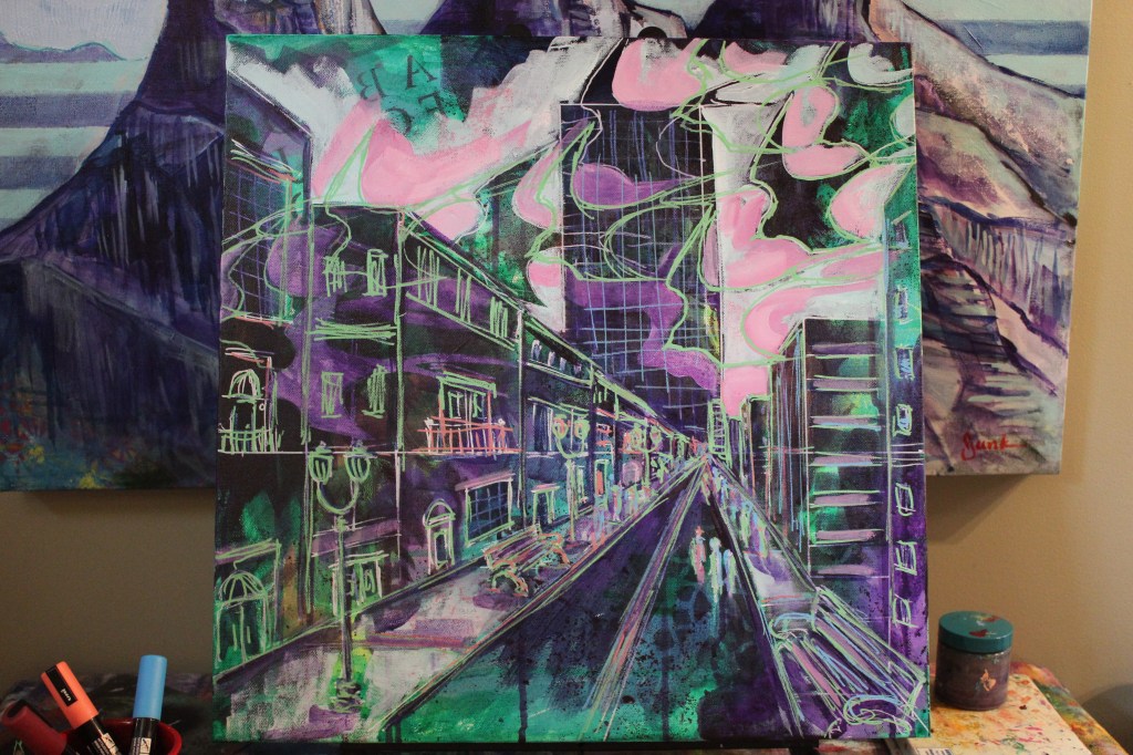
Inspired by graffiti, we will begin by utilizing acrylic paint, stencils, stamps or other mark-making tools to create a vibrant background. We will explore colour and contrast, while adding interest through mark-making in order to capture a vibrant city scene.
My husband works in thriving downtown location and during his daily walks will often take photographs of interesting buildings for me. I often like to sketch the images in a small travelling Moleskine before painting as I find that I can stretch my creativity when I don’t feel bound to a photograph. My colour choices become much more vibrant and I don’t tend to focus on details.
I called this body of work that focuses on these scenes ‘CityScapes’ but recognize that this same method could be used on houses, which I think would be lovely. Perhaps I’ll have to paint my home sometime. A large part of the work I do is based on a highly patterned ground as, even after all these years, I still can tend to feel intimidated by a blank canvas.
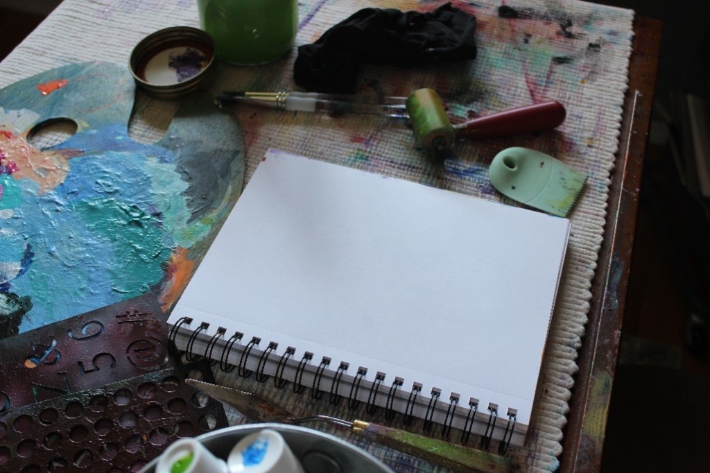
Tools & Materials:
- Stretched canvas, panel or paper
- Acrylic paints
- Flat & round paint brushes
- Water dish
- Rag
- Stencils & other mark-making tools (optional)
Tips:
- I used different sizes of paint brushes to create different types of marks.
- A stencil brush and acrylic paint can be used to add interesting patterns.
- If using paper, I suggest coating it with a layer of white gesso to add texture and substance to the surface though I did not.
- Clean water dish regularly to keep paint colours vibrant (another rule I don’t always follow).
Directions:
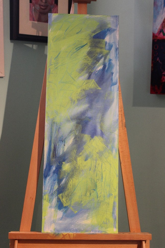
- Apply thin layers of colour to the canvas.
- Allow to dry well in between layers in order to keep colours vibrant.
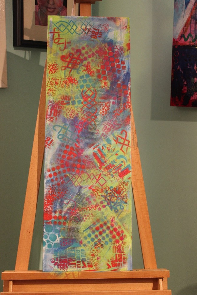
- Once that layer has dried, take your stencils and spray paint to a well-ventilated area and begin adding patterns. Pay attention to repeating pattern and colour around the canvas in order to keep the image interesting and the viewer’s eye moving around the surface.
- Once the canvas has dried (a heat gun or blow drier can help to speed things up) I like to use a thinned white paint and a round brush to draw my image on my prepared canvas.
- Once this layer has dried, I typically use layers of pthalo or Prussian blue or dioxazine purple thinned with water to capture the shadow areas. In this case I also used a glaze of thinned alizarin crimson to represent the colour of the bricks.
- At this point, I paint a variety of translucent and opaque colours in and around the images in order to make the object ‘pop’.
- After each layer dries well, I also use rulers and acrylic paint markers to straighten up my buildings as they can be a bit ‘wonky’, though I do like to keep them quite organic, and also to add more pattern and colour.
- I repeat these steps until I am happy with the final image.
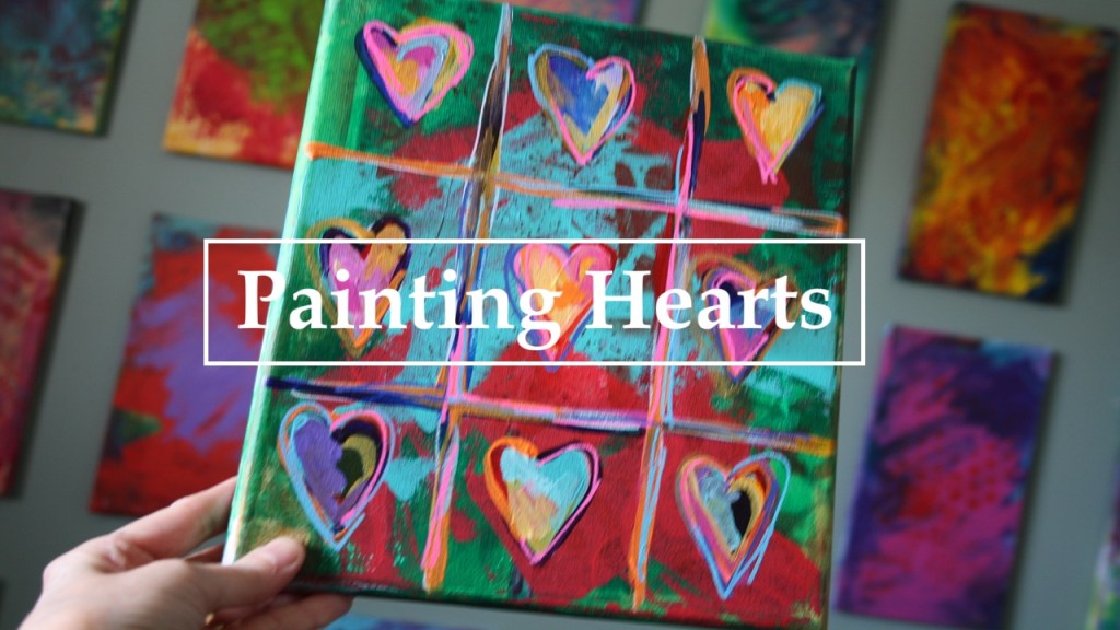
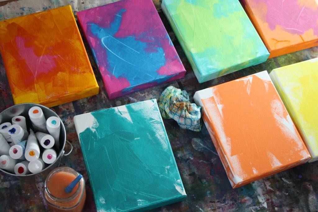
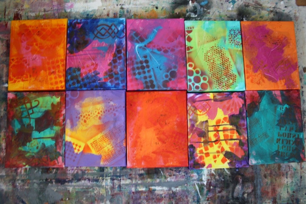
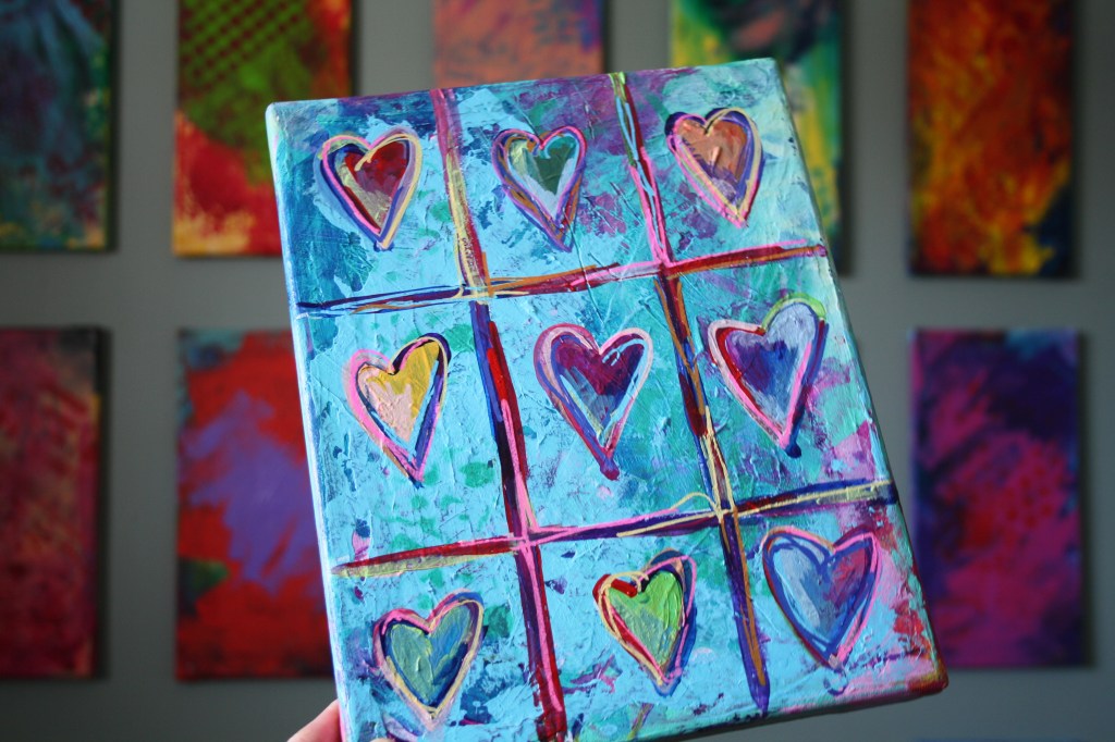
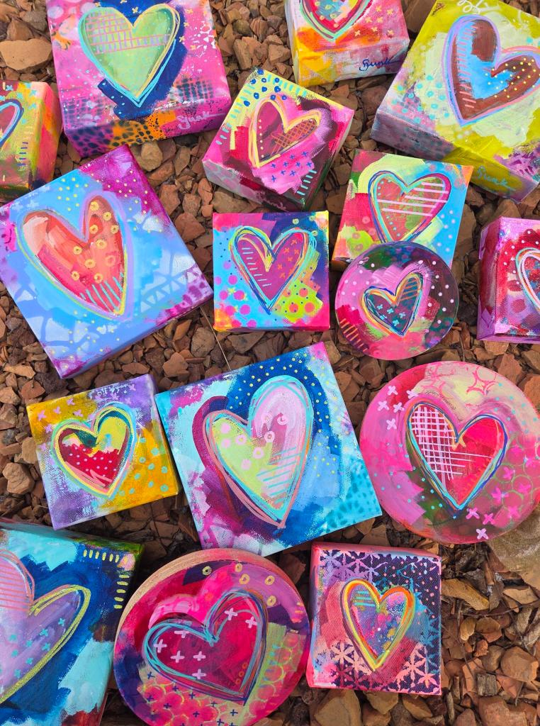
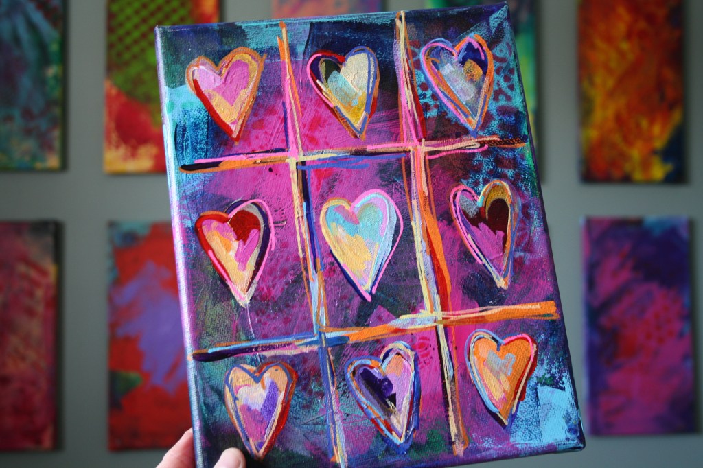
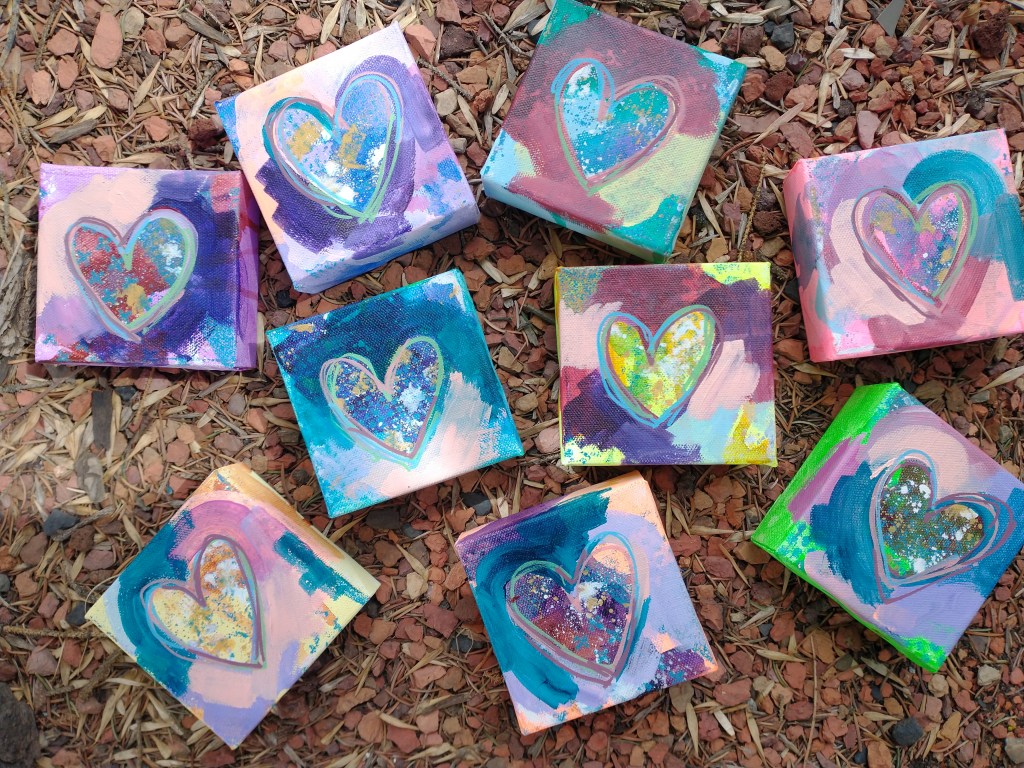
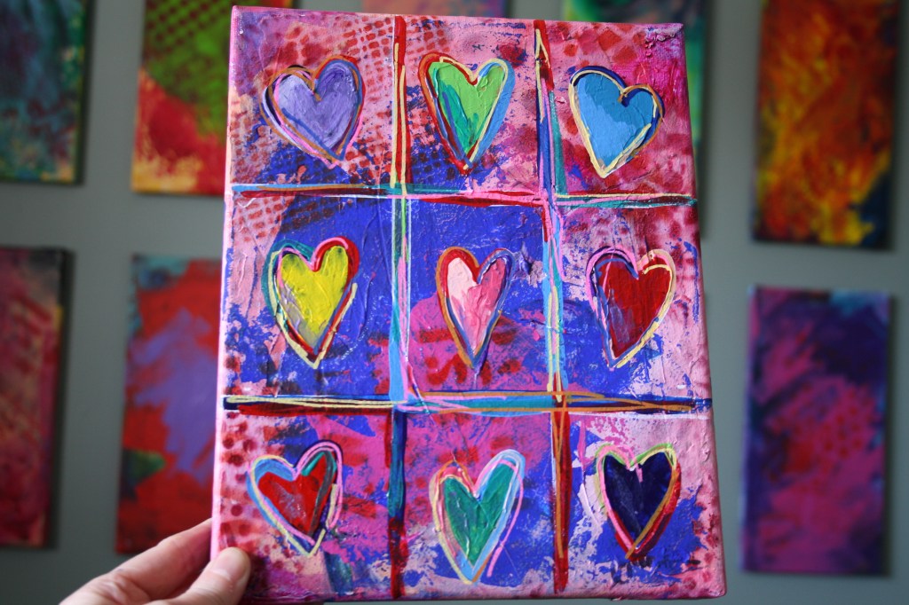
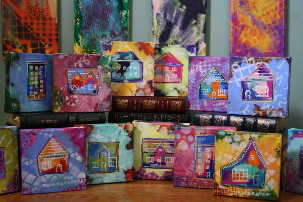
One of the most popular workshops in schools and otherwise have always been painted hearts and every year I like to paint some for Valentine’s Day. This is a great project when working with children and is a terrific introduction on how to keep colours vibrant. Painting hearts is a fun way to spend an afternoon and can be adapted in so many ways. This project also works well to make cards. When I’m painting these, I like to think of the things I’m grateful for…there is plenty of thinking time with all the layers of colour required. You can add as many or a little colour as you’d like, go bold or neutral.
Tools & Materials:
- Stretched 8×10 canvas (options: paint panels or paper)
- Acrylic paints (I think this project would work well with watercolours, too)
- Flat and round paint brushes
- Sponges (makeup sponges work well) and palette knife or plastic card
- Water dish, palette, rag & water spray bottle
- Stencils (optional)
- Acrylic spray paint (optional)
- Brayer or small paint roller (optional)
Tips:
- I like to use flat and small round paint brushes for added interest.
- A stencil brush and acrylic paint or simply adding patterns with paint brushes or sponges can be used instead of spray paint.
- If using paper, a layer of white gesso will add texture and substance to the surface.
- Clean water dish regularly to keep paint colours vibrant.
Directions:
- Using acrylic paint and a brayers/roller, palette knife or plastic card spread colour around the canvas. There is no need to cover the entire canvas at this point.
- Allow to dry well in between layers in order to keep colours vibrant.
- Select another colour and use another tool to add paint to blank spaces of the canvas. Allow to dry well.
- Using a translucent paint (or acrylic ink) and flat brush, add a transparent layer of colour in spots around the canvas (don’t cover all of the initial layer). You can wet the paint with plenty of water in order to allow the colour to spread and drip.
- Once that layer has dried, take your stencils and spray paint to a well-ventilated area and begin adding patterns (can also use a sponge at this stage). Pay attention to repeating pattern and colour around the canvas in order to keep the image interesting and the viewer’s eye moving around the surface. An option is to use the stencils with a paintbrush or sponge or to use items around the house such as jug lids, spatulas and brushes to add patterns of lines and circles. Finger tips create great dots.
- Using either a fine paintbrush and paint or a paint marker, split the canvas into thirds horizontally and vertically. I like to place two small marks equally separated along each edge then connect these ‘dots’ horizontally and vertically in order to create 9 spaces on the canvas.
- Draw a heart in each rectangle. Because these are quite child-like, I occasionally draw the hearts using my left (non-dominant) hand.
- Paint each heart a different colour and allow to dry.
- Finally, add more colours in each heart, around the edges of each heart and around the rectangles around each heart using either a small paintbrush or paint markers. Repeat this step until you are happy with the finished product.
OPTIONS: Create a large single heart painting on the 8×10 canvas or on a smaller canvas. Or separate the 8×10 canvas into 4 rectangles instead of 9 (draw a line down the center of the canvas in both directions). Paint around the heart instead of inside it. Or fold a piece of paper in half and cut out a heart shape in any size to use as a stencil if you would like a perfect heart. Create heart cards using watercolours or markers.
A second option is to create small houses in the same manner but add details such as windows and doors using an acrylic marker.
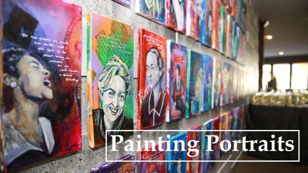
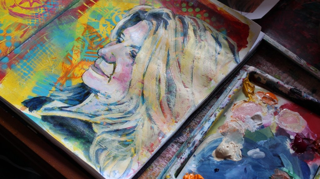
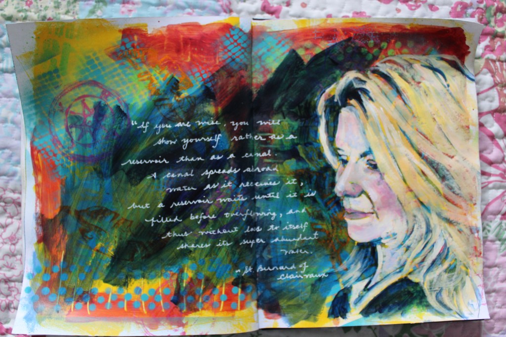
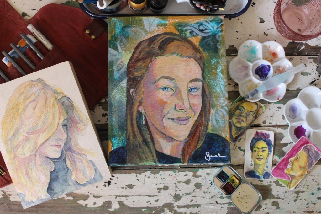
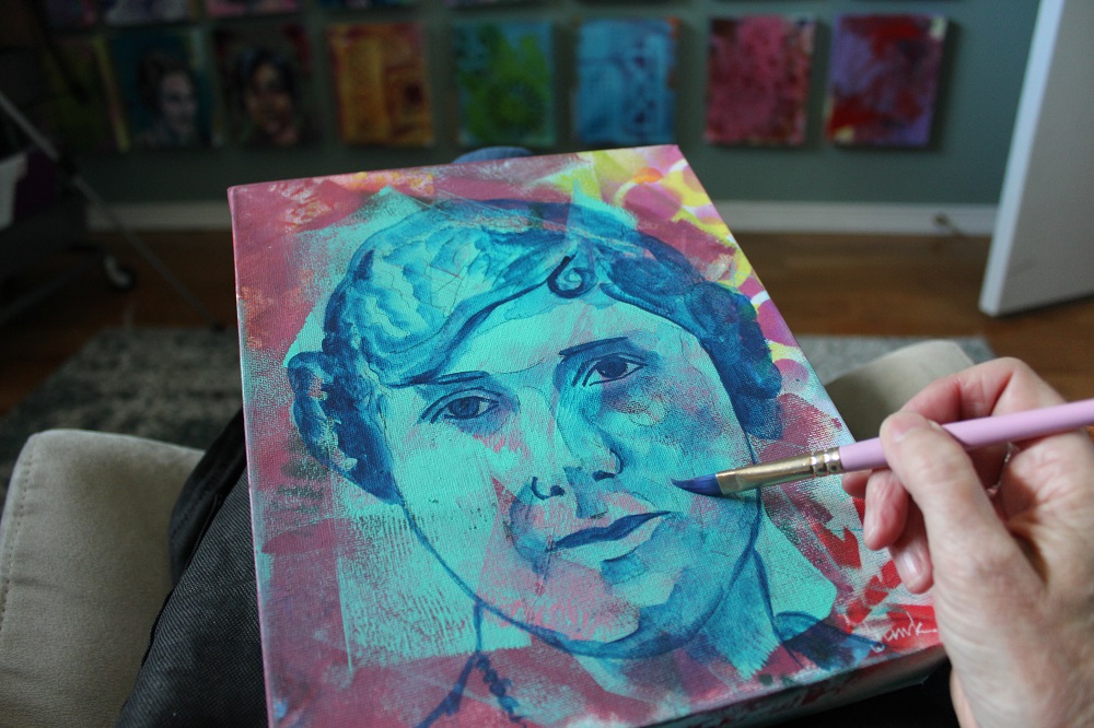
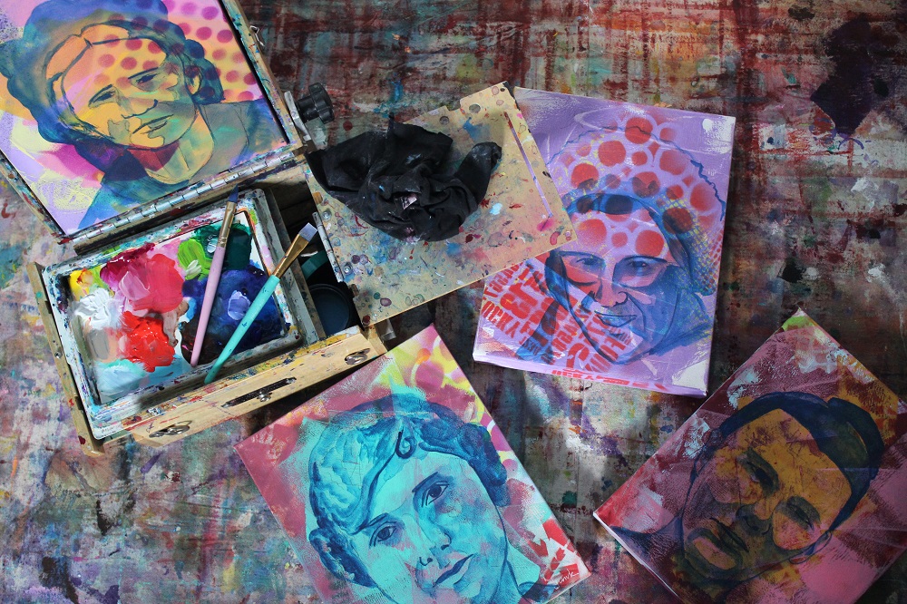
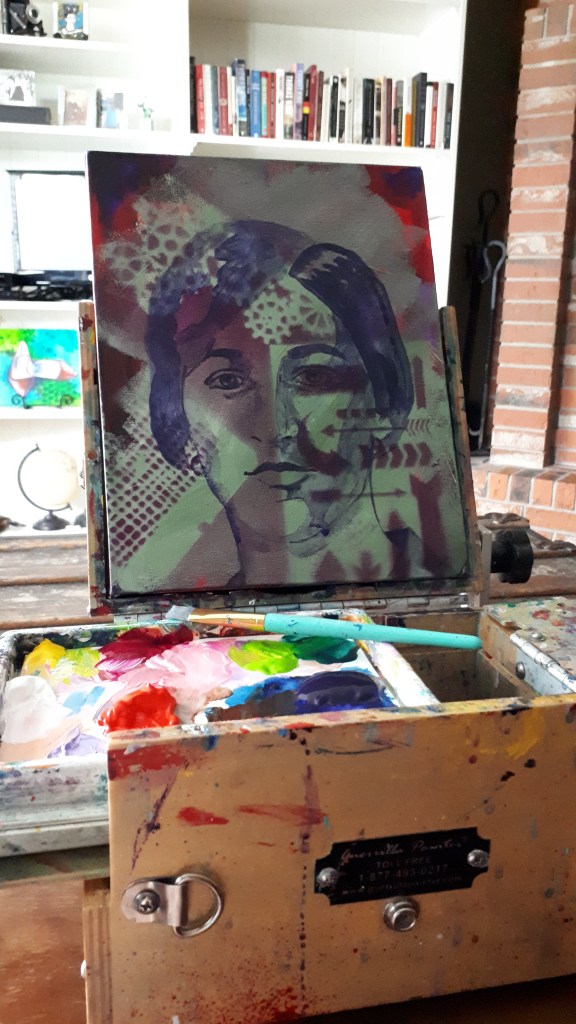
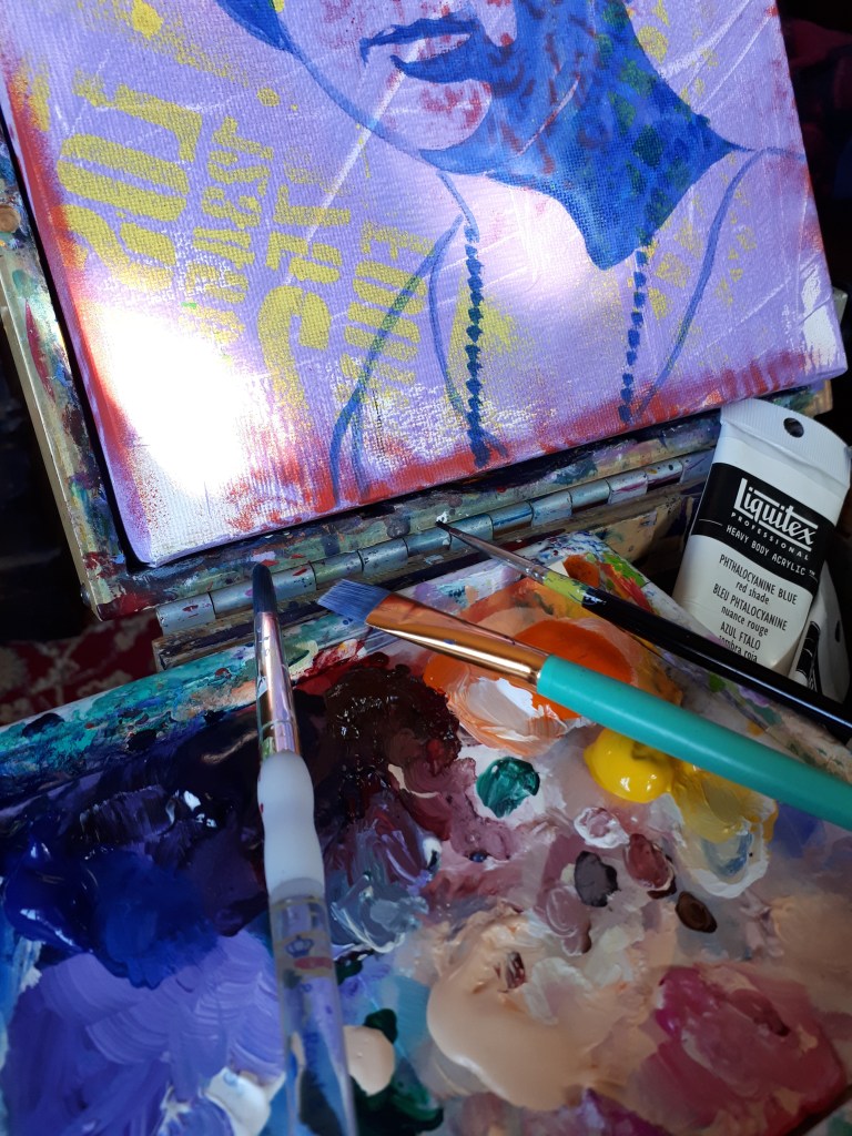
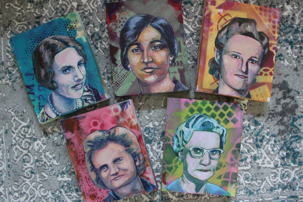
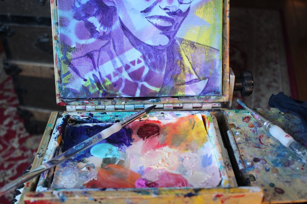
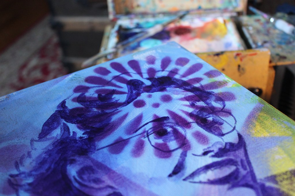
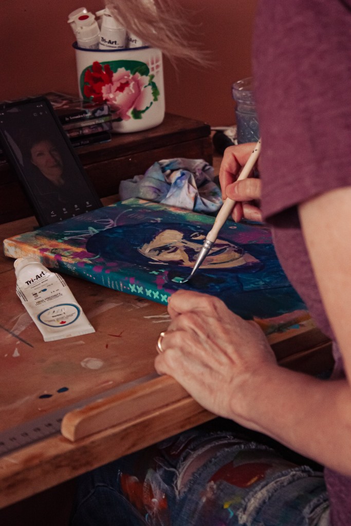
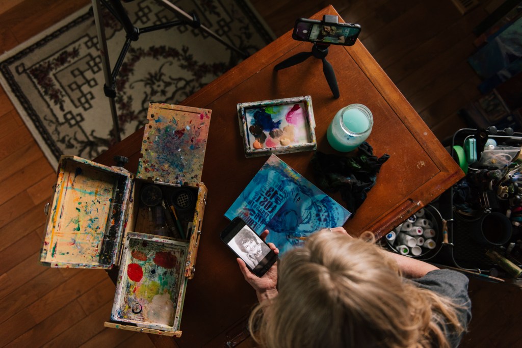
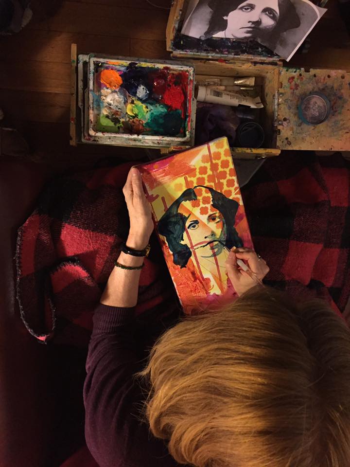
There are many ways to draw a portrait: by eye…just looking and paying attention to the shapes and shadows on a face. There are certain proportions to pay attention to like the fact that the head is typically an oval shape with adjustments to the jawline; eyes are about ½ way down the face shape instead of near the top of the head; the width of a head is about 5 eye shapes with the eyes being in the second and fourth measurement; the bottom of the nose is about ½ way between the eyes and bottom of the chin; the lips about ½ way between nose and chin; ears sit approximately even with the top of the eyes and bottom of the nose; the nose width is approximately straight down from the inner edge of each iris. You can also create a grid to transfer the image block by block (which is what I do). Or print an image and trace it which is what I share in high schools for a simpler, quicker portrait.
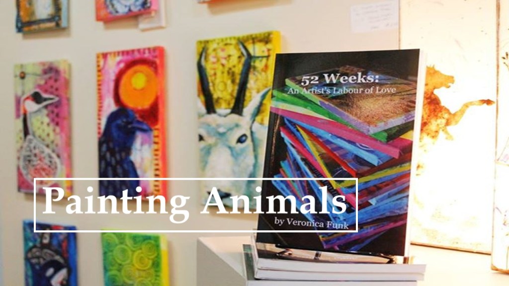
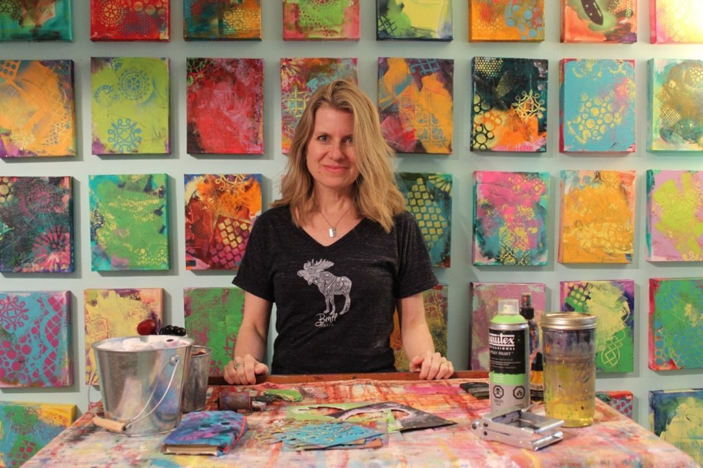
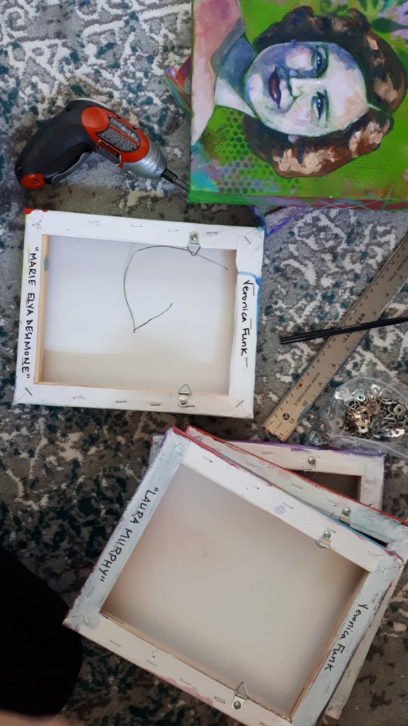
For several years I have continued the practice of creating a small painting a week following a particular theme. As a practicing artist I have found that working in series is great for so many reasons…not only to increase my skills and to challenge myself but also to have a focus and to learn to speak more clearly about what I do. It’s also great to try new methods of working and new materials. One year my youngest daughter encouraged me to focus on portraits as I hadn’t really worked on them since college a long, long time ago and so I began to paint the women who had impacted me in some way. Each week on my website I have shared their images, their words and stories of how they influenced me.
SUPPLIES:
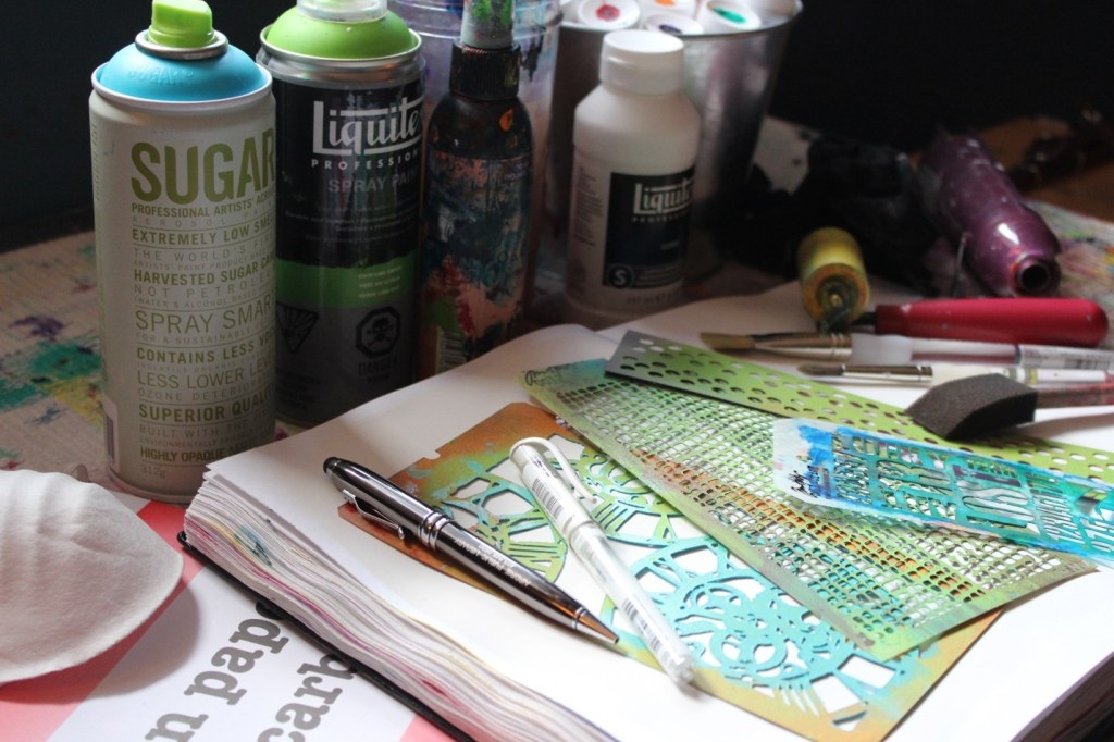
| White gesso Paintbrushes (3/4” flat + ¼” round) Stencils & rubber stamps Acrylic spray paint + mask (optional) Carbon paper + pen White Signo Uni-ball pen or Sharpee | Acrylic paint (warm & cool colours & white – see below) Heat gun or blow dryer (optional) Water dish Spray bottle Rag |
PREPARATION
The first step is to find a portrait that you connect with…when I created my 52 WEEKS::Heroes series, I focused on the women throughout history that influenced me and my daughters. When I began the series I hadn’t included quotes by them, but found that the further along that I was in the project, it was their words that resonated with me and so I began to include them with the images. The image you use can be printed on a printer or taken from a magazine, but be sure to have a larger face as it is easier to delineate features along with shadows on larger images rather than smaller ones.
PREPARING YOUR JOURNAL
I begin working in my journal by covering the page with gesso as this creates and nice chalky surface for the paint while keeping the page from buckling too much. I like to leave lovely brush marks using the gesso as the base. This has to dry for at least an hour.
While my pages are drying, I suggest researching the portrait. Whenever I research a project, I initially like to quiet and center myself to pay attention to the image I have collected. I like to use a form of journaling known as free writing, just writing as thoughts come to me while I consider a few questions:
- What is it about this image that appeals to me?
- Which colours jump out and why?
- Is there a phrase or feeling that runs through my thoughts?
- What is it about that specific image that I connect with…personality, pattern or form?
- If colours are catching my attention, what do the colours symbolize? If pattern, does it remind me of something else? If form, does its form replicate a form that I am surrounded by? Does it bring up memories?
After completing my 52 WEEKS::Heroes project it suddenly dawned on me that all the women had something in common…they were all activists for people’s rights. Some quietly and others quite vocally. I realized that this was how I had raised my own daughters. That in spite of challenges, each and every woman stood up for someone else, often for other women.
Now I always pay attention to how these images help me to tell my own story:
- How does this speak to me?
- Is there an area of my life that this speaks to directly?
- How can I apply this guidance?
- Where can I make changes in my life to be more like this?
- What does my spirit tell me about this image?
STEP 1
Though I do enjoy preparing my surface, I really have fun once I start adding colour. Some of my favorite colours for beginning artwork are the heavy staining ones such as alizarin crimson, pthalo or Prussian blue, quinacridone magenta and dioxazine purple. I tend to prefer heavy body paints as they can be thinned with water or thinning mediums.
One of my favorite ways to fill a surface with colour is to thin paint with a little water and brush it onto the surface, spray it with water and then allow to sit for a moment. Then, I tilt the surface to allow the paint to run down. I still manipulate the paint with my brush but it’s the drips that interest me. Add a few colours and allow to dry.
NOTE: If you don’t want muddy colours like greys or browns, use a layer of warm (orange, yellow, red) allow to dry (or dry with heat gun or hair dryer) and followed by a layer of cool (blue, green, purple), or vice versa. You can repeat these steps for several layers of colour and pattern. For each layer, I chose to use two colours – for the first layer I used cadmium yellow medium and alizarin crimson; for the second, vivd lime green and a turquoise spraypaint; followed by cadmium orange and medium magenta.
STEP 2
At this stage I like to bring my work outside to spray paint some stencil patterns onto the base. I intuitively place my stencils over the base and as I spray paint I lift each and turn it over in order to get the reverse stencil on the surface. I never worry about creating a perfect image as I love the imperfect appearance of street art or graffiti, which has been a huge influence in my work for several years. Note that you must always wear a mask and work in a well-ventilated are when using spray paint.
OPTION: Use a foam brush or make up sponge to dab paint through a stencil or use rubber stamps and thinned paint to add pattern.
STEP 3
Once the base has dried extremely well (you can use a heat gun or blow drier to hurry the process), take the photocopy or magazine image (I decided to use a photo of myself this time), place the carbon paper behind it with the dark side against the sketch book. Decide where you would like your image to sit on the page. Typically, a surface is mentally split into thirds and the image added to one of those sections to be visually pleasing. Tape this to your sketchbook and, using your pen, draw around the outline and main features of your image. I also outline shadow areas. You can remove the tape from three sides and lift while you work to view how well the image is transferring and if you have transferred enough information.
NOTE: I tend to draw out the image onto printer paper using a grid method: On my computer I select a portrait & crop; Then I insert 7×9 table on MS Word & pull down at corner to enlarge into equal squares; double click photo, click wrap text and then click behind text – I use this image on my computer screen to enlarge my drawing onto a blank sheet of paper which I then use carbon or graphite paper to transfer my drawing to my canvas.
STEP 4
I begin adding shadows using translucent acrylic paint thinned with water (in this case pthalo blue) to give form to my shape paying attention to which direction the light would be coming from. I use this dark colour for the eyes and hair as well. At this stage I use the acrylics more like a watercolour paint in that I layer thin washes of colour until I get the shades of dark that capture the shadows and dark areas (such as eyes) that I note in the original photograph.
STEP 5
I then begin adding highlights by mixing unbleached titanium, titanium, a bit of cadmium orange and cadmium yellow medium for pale skin tones (or burnt umber with a bit of pthalo blue or dioxazine purple and unbleached titanium for darker skin tones). I keep working back and forth with layers of thinned paint for shadows and lighter mixes for highlights. I also go back into the portrait with washes of pthalo blue and deep magenta. My final step on the portait is to add a white dot in the eyes for a highlight. I also use a wash of a transparent colour (in this case pthalo blue) to paint around the image in order to increase the contrast and highlight the portrait.
STEP 6
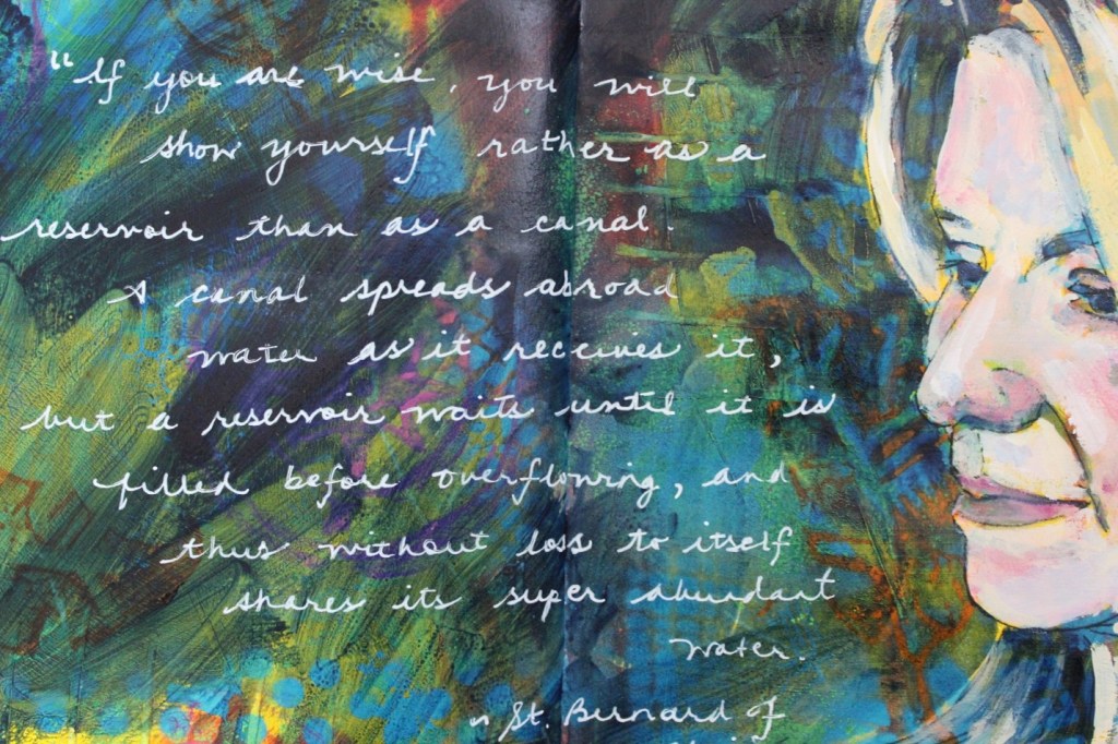
After the image has completely dried (I usually give it 24 hours), I will add some of the information I’ve gathered on the person in order to use this as a guide in my life. An alternative is to journal around the image in your own words or with your favorite quote. Some of my favorite writing implements are paint pens (the white signo uni-ball pen), Sharpees and a calligraphy or fine liner paintbrush.I find that whomever I connect with shares my story in some way. They are not only a guide, but also a reminder of the strength of our own story and share the value that each one of us brings to this life.
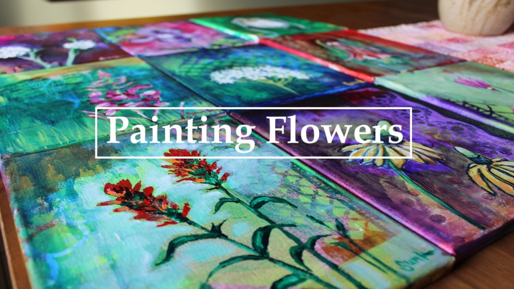
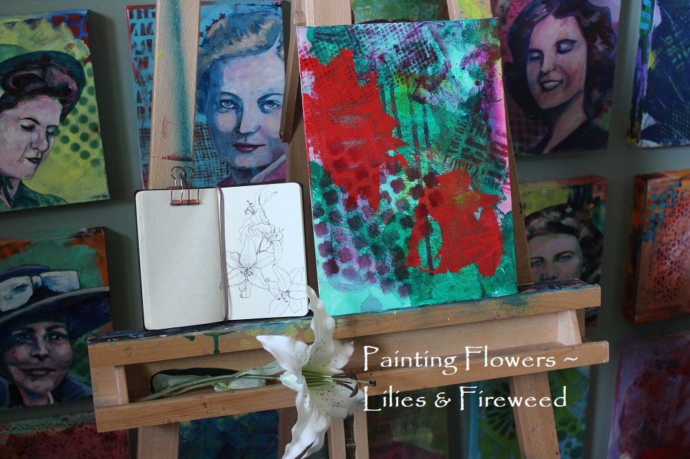
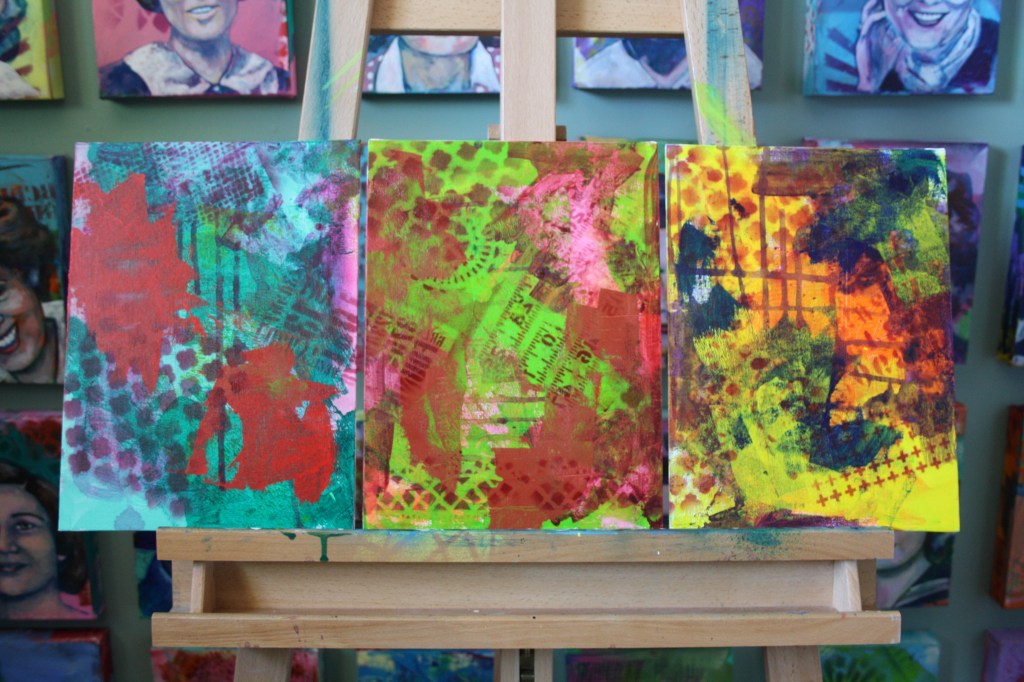
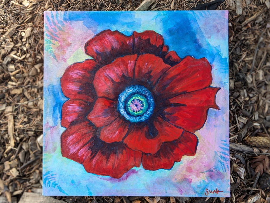
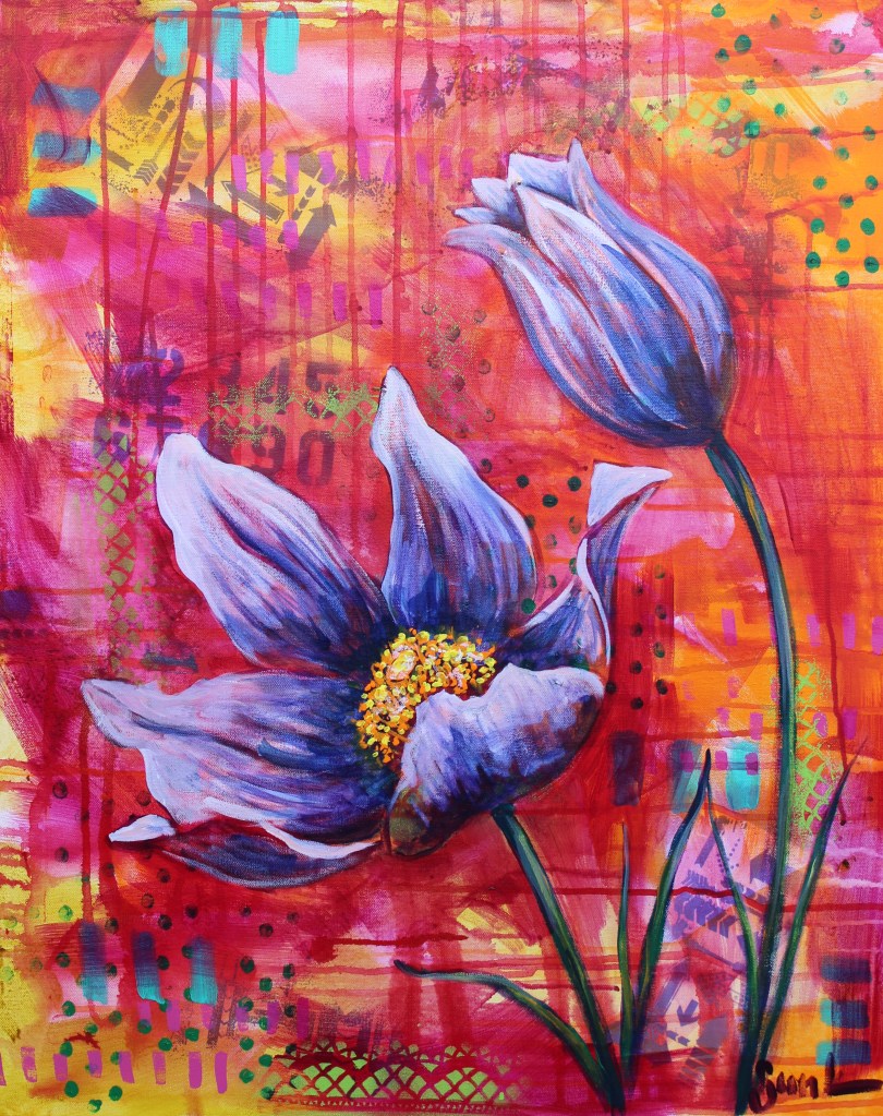
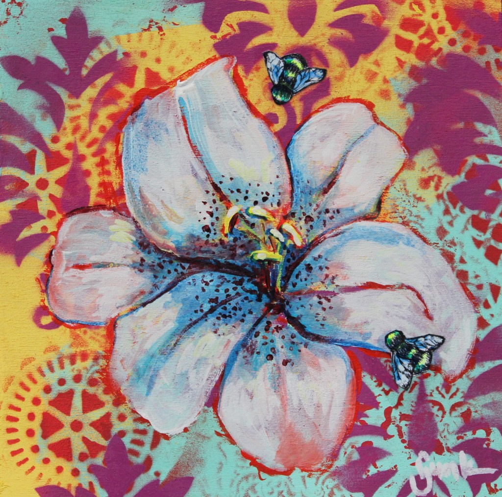
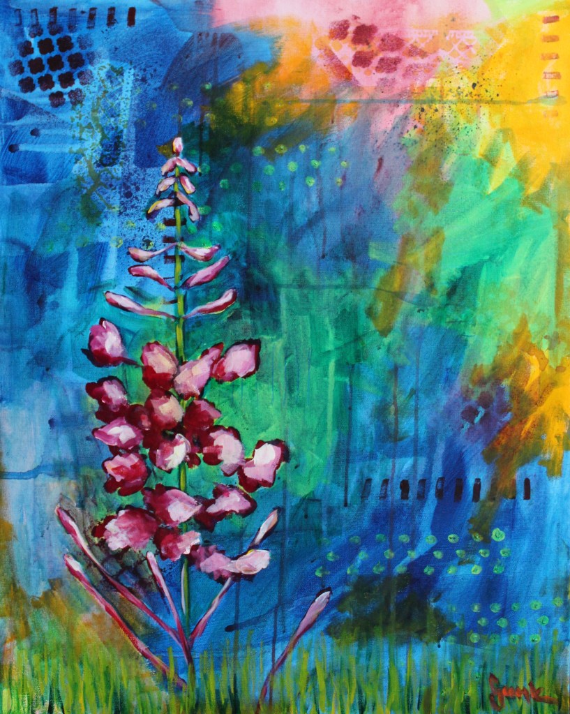
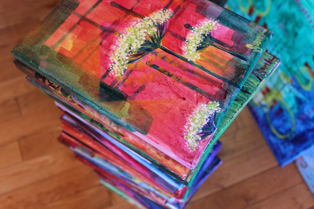
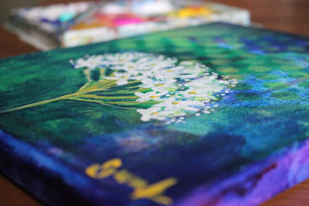
In college many, many years ago I was often referred to as ‘the flower painter’…it wasn’t because my work was necessarily the best, but rather because I enjoyed the process so much. My family has allergies which doesn’t allow me to bring flowers into my home, but I can enjoy them in my garden and in my artwork. I really like the fact that there is no perfection in them, and in fact, the imperfections just seem to add to their beauty.
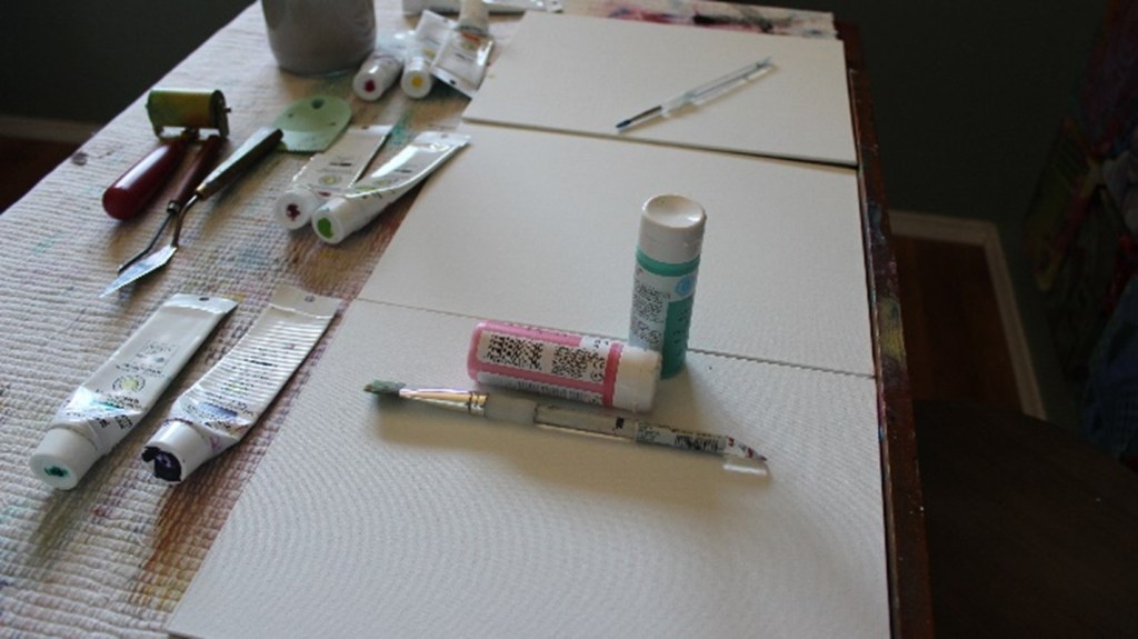
Tools & Materials:
- Canvas panels (options: paper, stretched canvas, or wood)
- Acrylic paints
- Flat and round paint brushes
- Water dish, rag & water spray bottle
- Reference flowers or photos
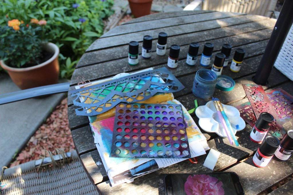
- Stencils
- Acrylic paint, spray paint or air brush
- Brayer or small paint roller, palette knife, gift cards (optional)
In my introduction I mentioned the importance of a rag twice…it wasn’t on purpose but it is a valuable part of my artist’s toolbox. My favourites are cut from my husband’s old cotton t-shirts as they don’t lose bits of fibre in my painting and they are very absorbent and can be thrown in the laundry with the rest of my painting clothes.
Additional Tips:
- I use a couple of different sizes of paint brushes for added interest.
- A stencil brush and acrylic paint can be used to add pattern or simply add patterns by using paint brushes and container lids instead of stencils.
- If using paper, I do recommend a bit of a heavier weight like watercolour or mixed media papers along with coating the surface or substrate with a layer of white gesso to add texture and substance to the surface.
- Even though I don’t always follow this advice, I do recommend cleaning your water dish regularly to keep paint colours vibrant.
- Whenever I feel the need to make the background feel more cohesive, after I have finished painting a flower, I will cover the entire surface behind it with a glaze of transparent paint.
- I will sometimes sketch out flowers to plan my painting, but usually find that any little ‘mistakes’ add to the completed painting.
Directions:
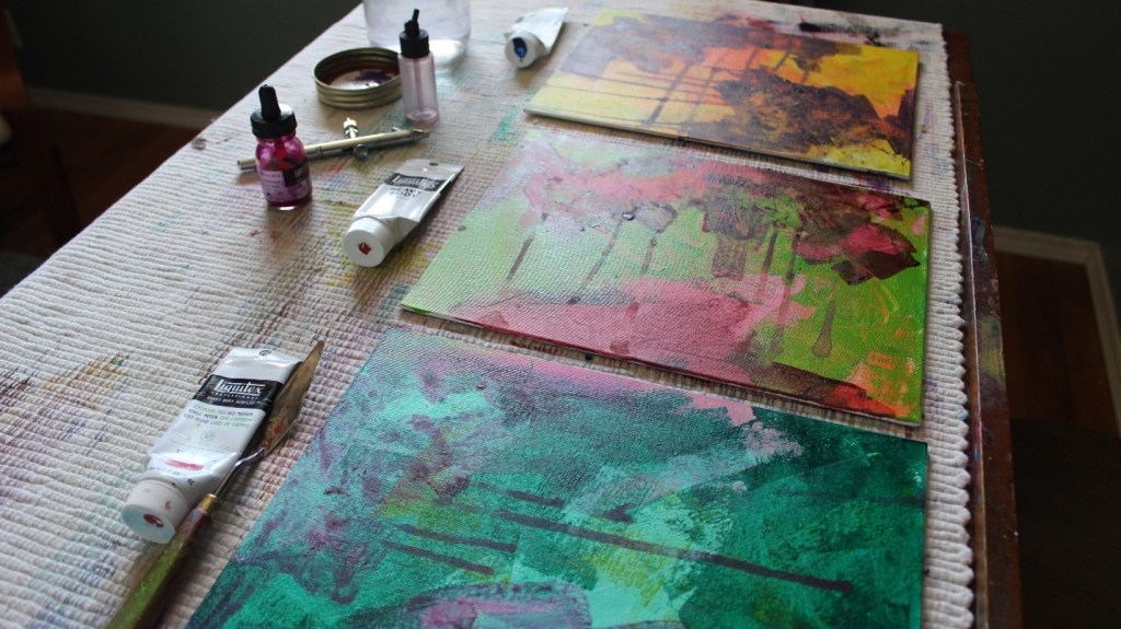
- Using acrylic paint and brushes and brayers/rollers and plenty of water (a spray water bottle also works well), apply colour liberally on the canvas.
- Allow to dry well in between layers of colour in order to keep colours vibrant.
- Using a translucent paint (or acrylic ink) and flat brush, add a transparent layer of colour in spots around the canvas (don’t cover all of the initial layer). Wet with plenty of water and allow the colour to spread and drip.
- Once that layer has dried, use your stencils and spray paint or airbrush to a well-ventilated area to add stenciled patterns. Pay attention to repeating pattern and colour around the canvas in order to keep the image interesting and the viewer’s eye moving around the surface. An option is to use the stencils with a paintbrush or sponge or to use items around the house such as jug lids, spatulas and brushes to add patterns of lines and circles. Finger tips create great dots.
- Using either the flower or the reference photo and a small round or flat brush along with a colour such as dioxazine purple, pthalo green, pthalo or Prussian blue or alizarin crimson to draw directly onto the canvas. If the background is dark, I also like to use titanium white to draw my image. If you are unhappy with a line, just wet and wipe away with a rag. Once your drawing has dried, use a rich, transparent colours (like those listed above) to fill in the dark areas or shadows of your flower and background and, once that is dry, use a bit of colour mixed with white to add highlights. Keep in mind that it is better to add colour to the white rather than white to a colour as most colours tend to be quite strong.
- Finally, allow to dry and then add final highlights and add shadows or increase background contrast with thinned deep colour as needed.

